Which gallery wall suits a living room depends on how much variety the art already has: mismatched pieces need one repeating finish or color to hold them together, while a matched set only needs exact spacing.
The ideas here run from printable downloads and thrifted frames touched up with spray paint to hardwired gallery wall lighting that calls for an electrician and a landlord’s permission.
Even a loose, off-balance cluster looks planned when the gaps stay near 2 inches on every side.
1. Mix of Frame Styles and Colors
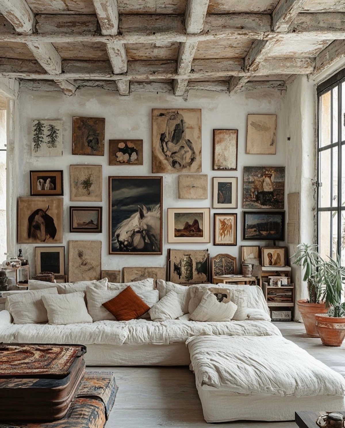
Wood frames beside gold ones keep a wall from looking like it came out of one box. Pick two or three finishes and repeat each at least twice, so the mix reads as a decision and not an accident.
Thrift stores and flea markets are the cheap source for odd frames. A coat of spray paint can pull a stray one into your chosen finishes.
Keep the mat color consistent, since white mats calm a lot of frame variety. Lay everything on the floor first and shuffle before you drive a single nail.
2. Cohesive Color Palette
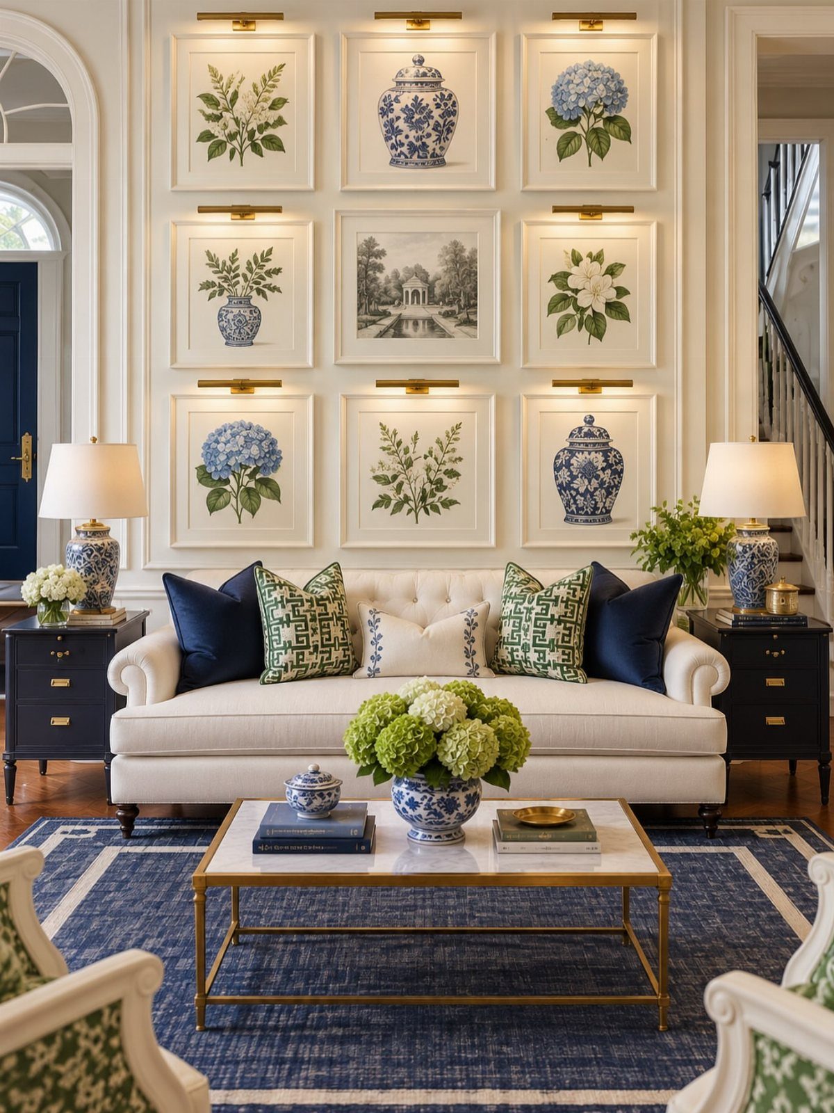
3 colors, repeated, do more than any single piece of art. Pull them from what’s already in the room, like a rug or a sofa, so the prints echo those tones.
A 3×3 grid suits this well, because identical layouts let the color carry the look. Botanical prints in greens and blues sit easily against white, and a few porcelain pieces can break up the flat paper.
Print files at home or order inexpensive downloads to stay on budget. Check each print against the rug in daylight before framing, since screens flatter colors that paper doesn’t.
3. Keep Spacing Consistent
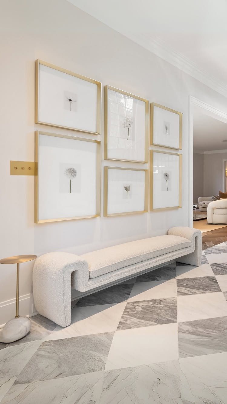
Even gaps are what make a cluster of frames look planned. Pick one distance and hold it on every side; a gap of 2 inches is a common choice, and tighter reads cleaner than wider.
Cut paper templates for each frame and tape them to the wall first. A spacer block cut from cardboard to your gap size, held between frames as you hang, keeps every measurement identical without a tape measure.
Matching frames help, as in a row of gold ones, but consistent spacing can rescue mismatched frames too. A level is worth the few dollars.
4. Black and White Photography Wall
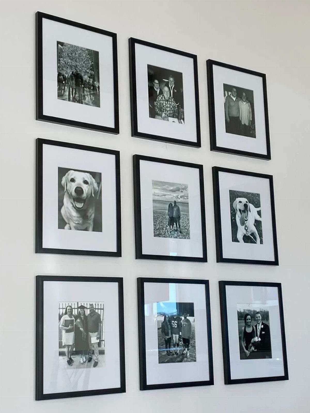
Black and white photography has an easy advantage: no color to match. Family portraits, pets, and landscapes can share a wall because the tones already agree, and a grid of identical black frames pulls them together.
Convert color photos with any free editing app, then print them at a drugstore or online lab, which costs far less than custom art. Use the same size for every print so the grid stays tidy.
Mats in white make mixed subjects look deliberate. I would pick matte prints over glossy to avoid glare from windows.
5. Non-symmetrical Arrangement
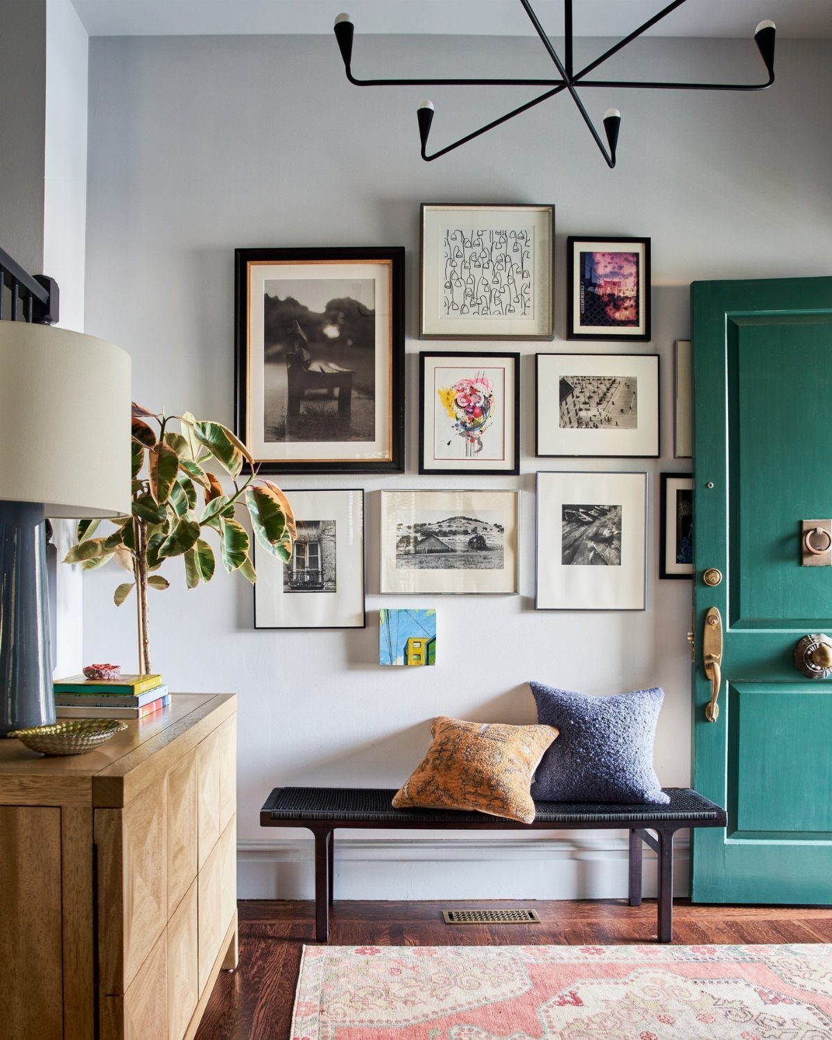
Off-balance can look more relaxed than a perfect grid. Start with your largest piece, set it slightly off center, then build smaller frames around it so the whole cluster feels weighted but not mirrored.
Mixed frame sizes and finishes suit this layout, which makes it forgiving for renters collecting art over time. Trace each frame on kraft paper, cut it out, and tape the shapes up to test arrangements without making holes.
Keep the gaps between frames close to equal even when the shape is irregular. That tension between loose outline and steady spacing is what keeps it from looking messy.
6. Gallery Wall Lighting
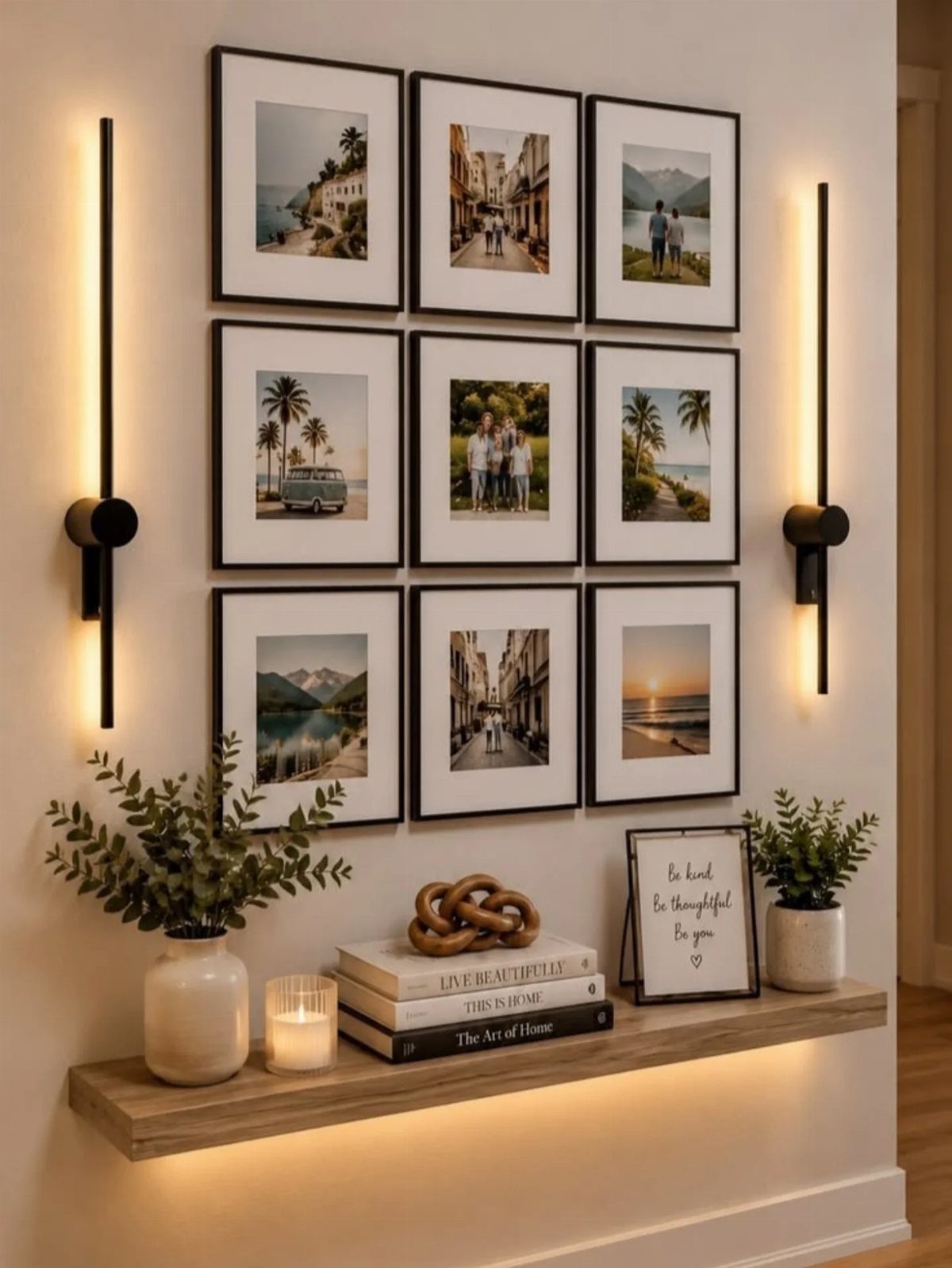
Lighting turns framed photos into a feature after dark. Slim wall lamps on either side, like two vertical black sconces, frame the group and add light without crowding it.
Plug-in versions with cord covers suit renters, since they skip the electrician. Hardwired ones look cleaner but need an electrician and permission from a landlord.
Choose a warm bulb so skin tones in photos don’t turn gray. Aim the light across the wall, not straight at the glass, to cut reflections.
7. All White Frames
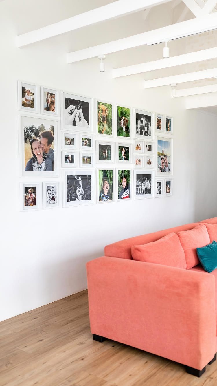
White frames on a white wall let the photos do the talking, and the frames fade into the background. Matching frames also make a long run of pictures easy to line up.
Spacing has to be exact here, because nothing distracts from a crooked gap. The maker of this wall marked the spots with pencil.
Choose one frame depth and one mat width across the whole set. Warm family snapshots look best with a white mat.
8. Incorporate Mirrors and Clocks
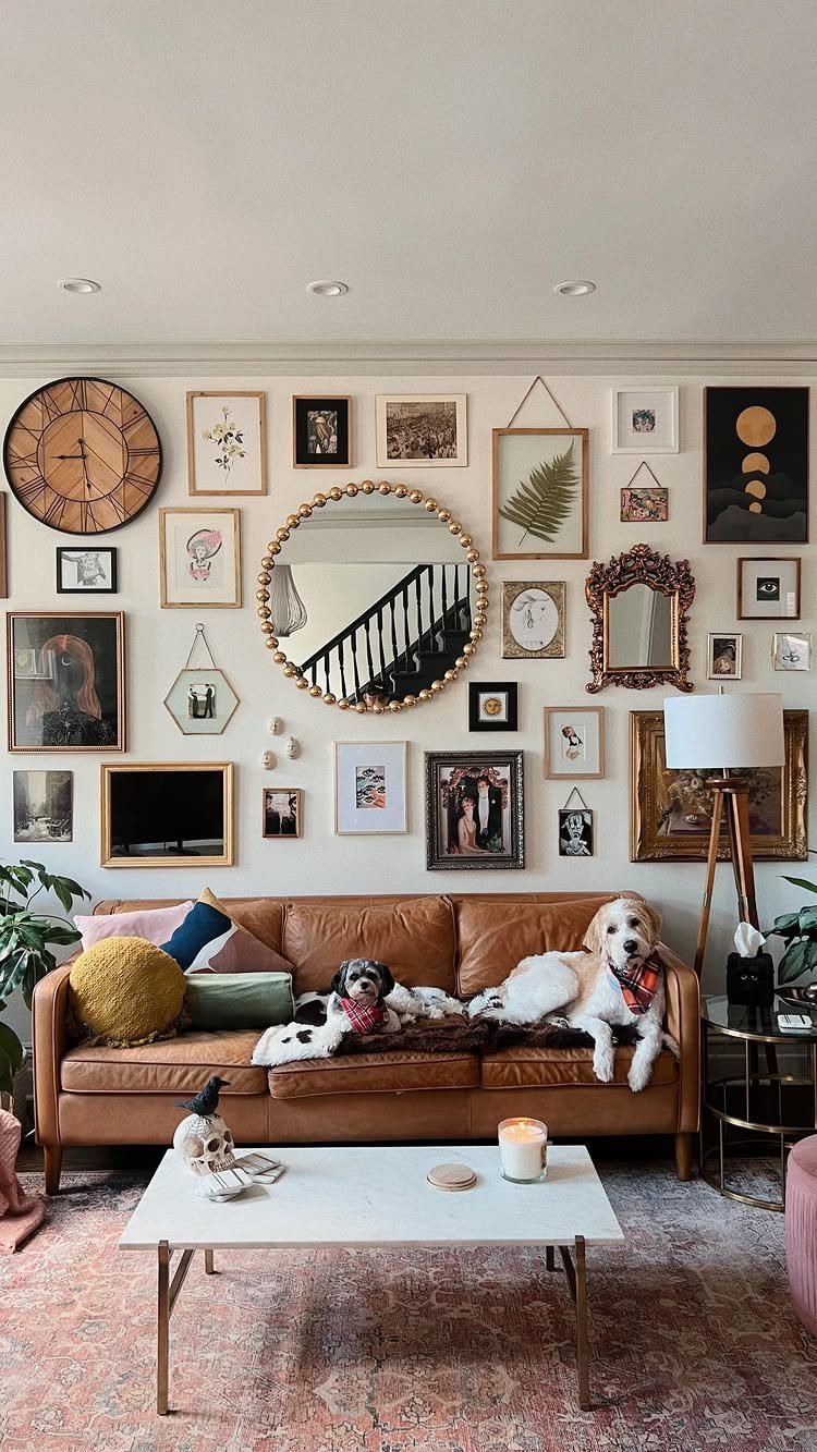
A round mirror gives a gallery wall a break from rectangles, and a wall clock does the same job while telling time. Hang the largest round piece first, then fill in around it with frames.
Mirrors also bounce light across a room, so place one where it catches a window. Keep the clock’s finish close to your frame finishes so it reads as part of the set.
I would use one big mirror and one small one, not several mid-size ones, so the sizes stay varied.
9. Gallery Wall Around a TV
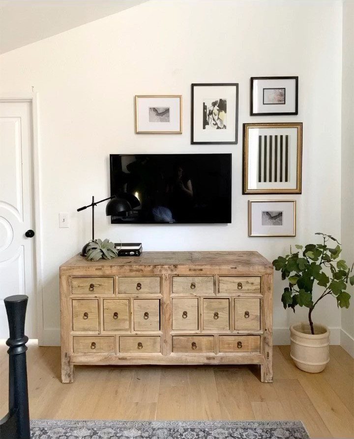
A TV doesn’t have to sit alone on a wall. Framed prints on all sides turn the black screen into the center of a group, and the art softens it when it’s off.
Hang the TV first, since it can’t move.
Then build outward, keeping the gaps between frames and screen equal. Tape paper cutouts around it to test the spread before making holes.
Choose frames in one finish so the screen doesn’t compete with the mix.
10. Mix 3D Wall Sculptures with Art
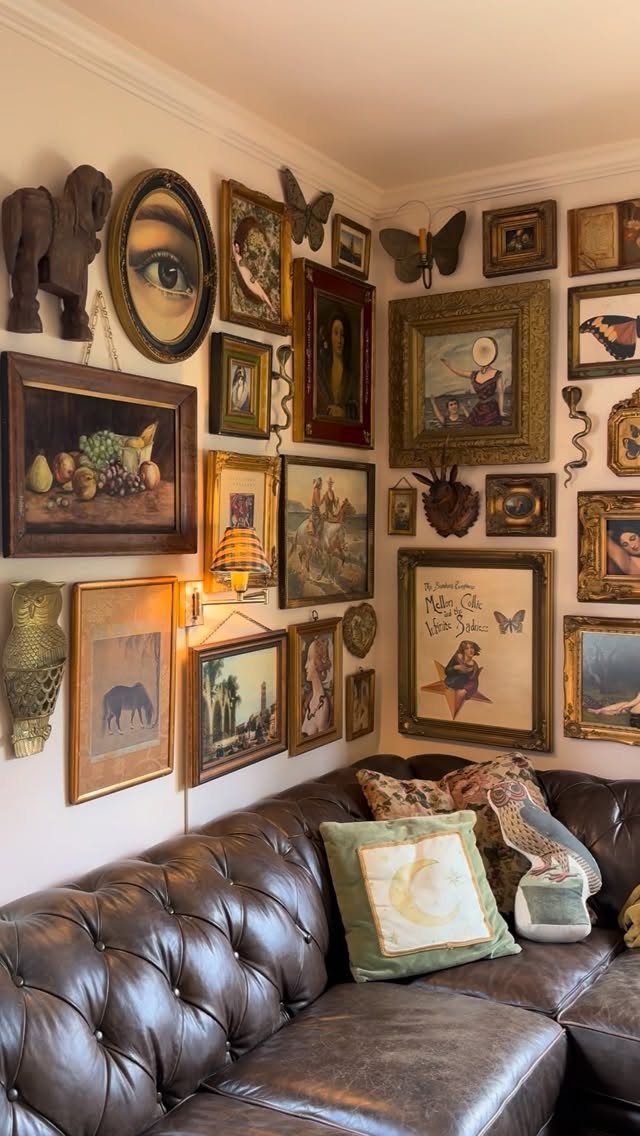
Sculpted animal heads and other 3D pieces add depth that flat frames can’t. Mixed in with paintings, they make a dense wall feel collected and a little playful.
Hang the sculptures first, as they’re the heaviest and bulkiest, then fit frames around them.
Check each one’s weight and use the right anchor for it. Leave a bit of space around raised pieces so shadows don’t crowd the art.
I would keep the sculptures to one material or color, so they read as a family against the varied paintings.
11. Botanical Art Print Grid
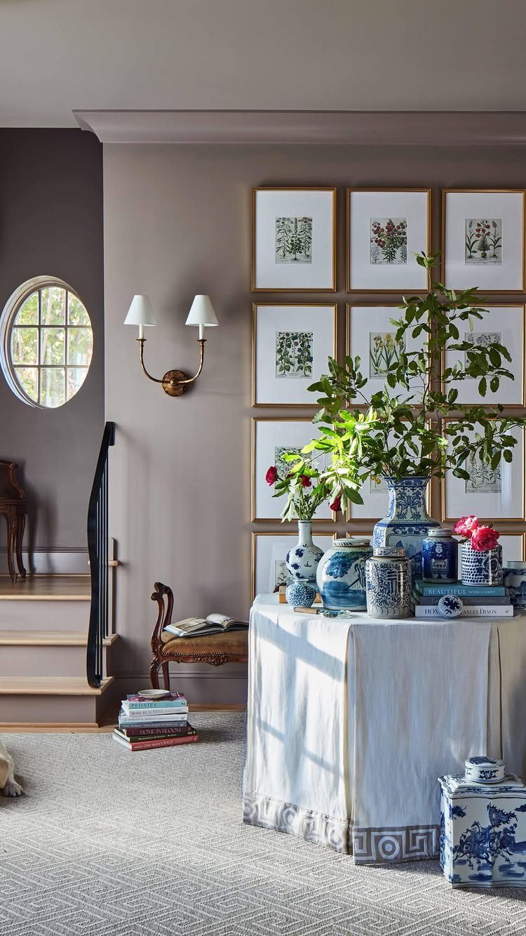
6 botanical prints in a 2×3 grid make a calm wall that takes little planning. Matching frames and mats let the leaf shapes carry the look.
Buy prints in one style, such as all leaves on a plain background, so the set looks like a series. Print them at the same size for a tidy grid.
A neutral wall suits the greens best. A table underneath with books and a few pieces of porcelain extends the wall into the room.
12. All Gold Frames
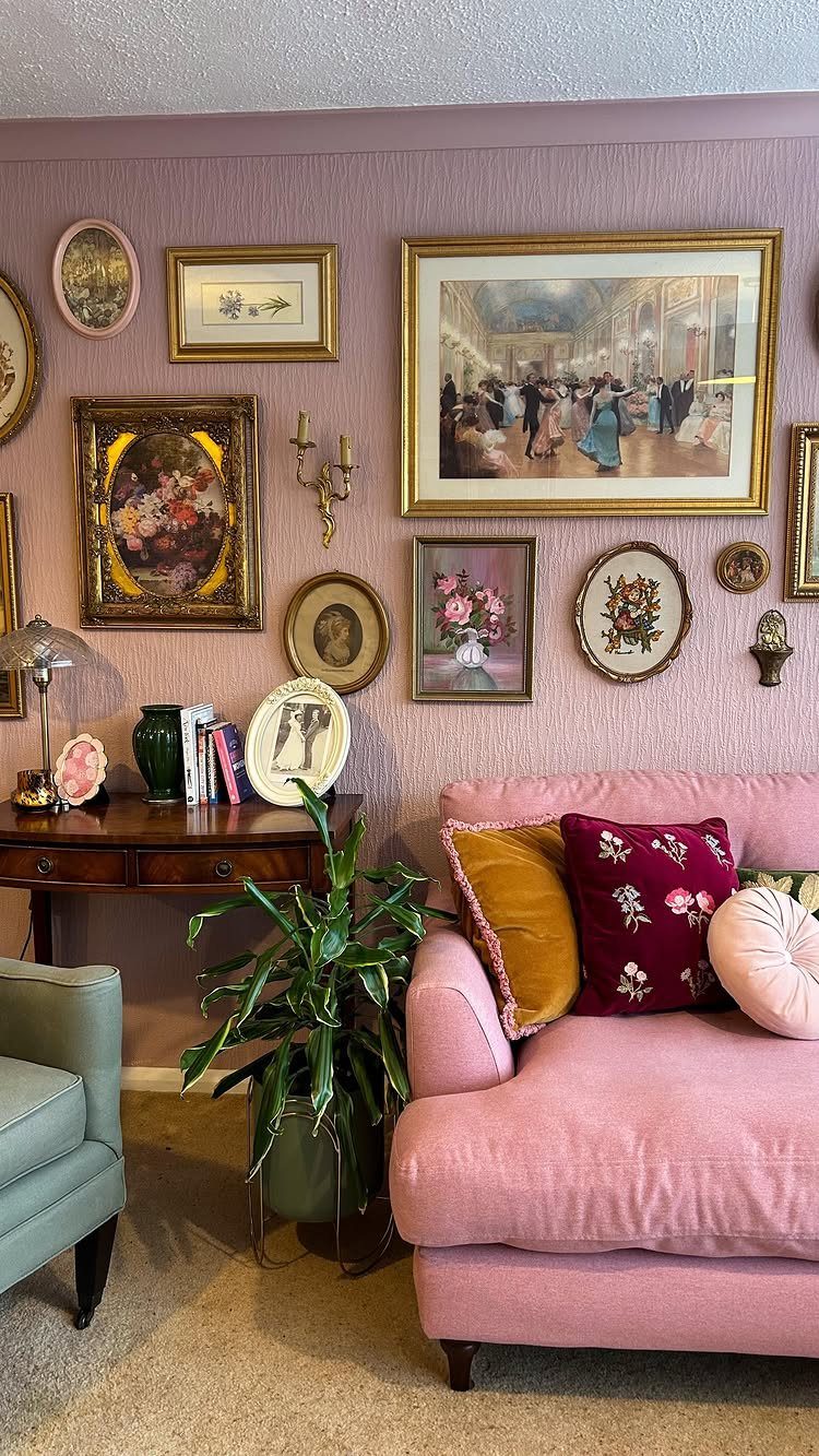
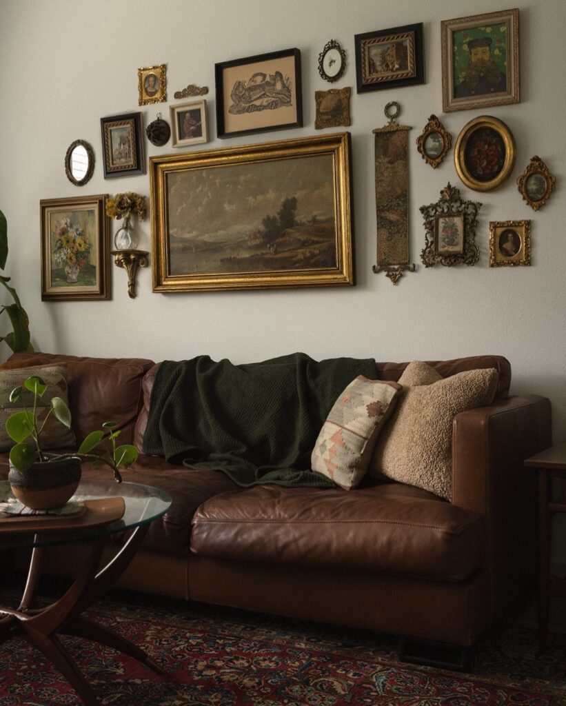
Gold frames pull mixed art into one set. Oil paintings and portraits of different sizes still look related when every frame shares the same metallic finish.
Ornate frames suit older-looking paintings best.
Thrift stores are a cheap place to find them, and gold spray paint can fix a mismatched one. Test the paint on a hidden corner first.
Gold looks strong against a colored wall, like pink, so the frames stand out.
On a white wall it reads softer. I would choose the colored wall for drama.
13. Framed Abstract Art Collection
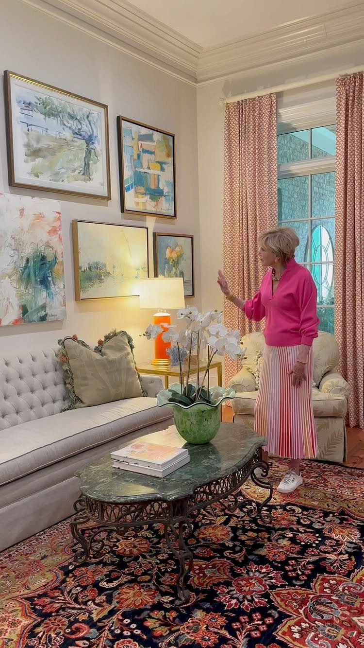
Abstract paintings forgive a lot, which makes them a good fit for a first gallery wall. With no horizon line or subject to keep level, a slightly uneven hang reads as casual, not wrong.
Pick pieces that share a few colors, then pull one of those colors into the room with a pillow or a throw.
A tufted sofa and a marble coffee table already supply texture and pale tones, so the art can carry the color.
Frame everything in one finish and keep the gaps between frames equal. Tape paper cutouts to the wall and rearrange them before any nail goes in.
I would mix one large canvas with smaller pieces, so the wall has a clear anchor.
Choosing the Right Wall
A wall you see every day beats a hidden one, and the blank stretch above the sofa is the obvious candidate in a living room.
Skip walls where frames would fight for space with built-ins or large pieces already anchored there. A gallery needs open space around it to breathe, but a wall so huge that the arrangement looks small is just as wrong.
Matching frames and black-and-white photos give a clean, modern look, while mismatched frames and textured pieces read as layered and collected over time. That choice settles which wall suits the job, so make it first.
The living room and dining room are classic candidates for gallery walls, but Twesten says framed art has been tapped to fill empty walls in unexpected places in 2025.
Art Sourcing Tips
Free art is easier to find than most people think. Large US museums, the National Gallery of Art among them, let you search their collections and download public domain images at no cost.
The downside is time, since sifting through collections takes hours. A digital print set on Etsy shortens the search; one set cost about $10, and many are public domain images already grouped for you.
Local artist shows are the third source, and the best one if you want original work with a story behind it. Prices vary, so set a budget before you go.
Look at the print size before you order frames.
Maintaining Visual Balance
Balance comes from visual weight, not from mirrored halves.
Mixing vertical and horizontal pieces adds interest, but watch how the edges line up. Clean edges keep a varied wall looking cohesive.
Make sure every smaller frame connects back to the anchor in at least one way. It can share a color pulled from the anchor, a related material such as a drawing or photograph beside a painting, or a contrasting shape.
Lopsidedness isn’t the mistake.
A heavy cluster on one side with nothing to answer it is. Step back and squint; if one corner pulls your eye, add or move a piece.
Frequently Asked Questions
Are gallery walls still in style?
Yes. They have relaxed since the strict grid days: more mixed materials, color that actually stands out, and asymmetry that feels deliberate rather than accidental.
Mirrors, clocks and sculptural pieces now sit among the frames, and a wall that feels collected over time reads as current.
What is the rule for gallery walls?
Aim for 57 inches from the floor to the center of the whole arrangement, the height where most eyes land naturally.