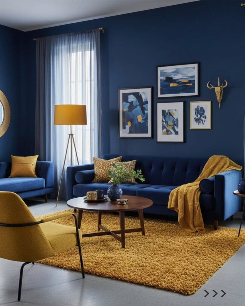
The 10 colors here run from terra-cotta and Hale Navy to crisp white and soft light blue, and the one fact that picks among them is the light in your room: which way the windows face and how much daylight reaches the walls.
A color that glows in a north-facing room can look flat in a south-facing one. Whatever you land on, paint a large sample board and check it near your sofa and again after dark.
1. Terra-Cotta Living Room Paint Colors
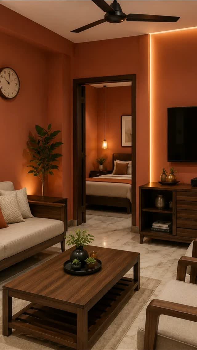
Terra-cotta asks for wood in the room, and a brown coffee table plus warm floors give the orange-red walls something to sit against.
Test it first. Paint a large sample board and move it around the room for a day, since a color this warm shifts between morning and evening light.
Painting the walls in one continuous color, including into the doorway to the next room, keeps the whole space feeling connected.
2. Saybrook Sage Living Room Paint Colors
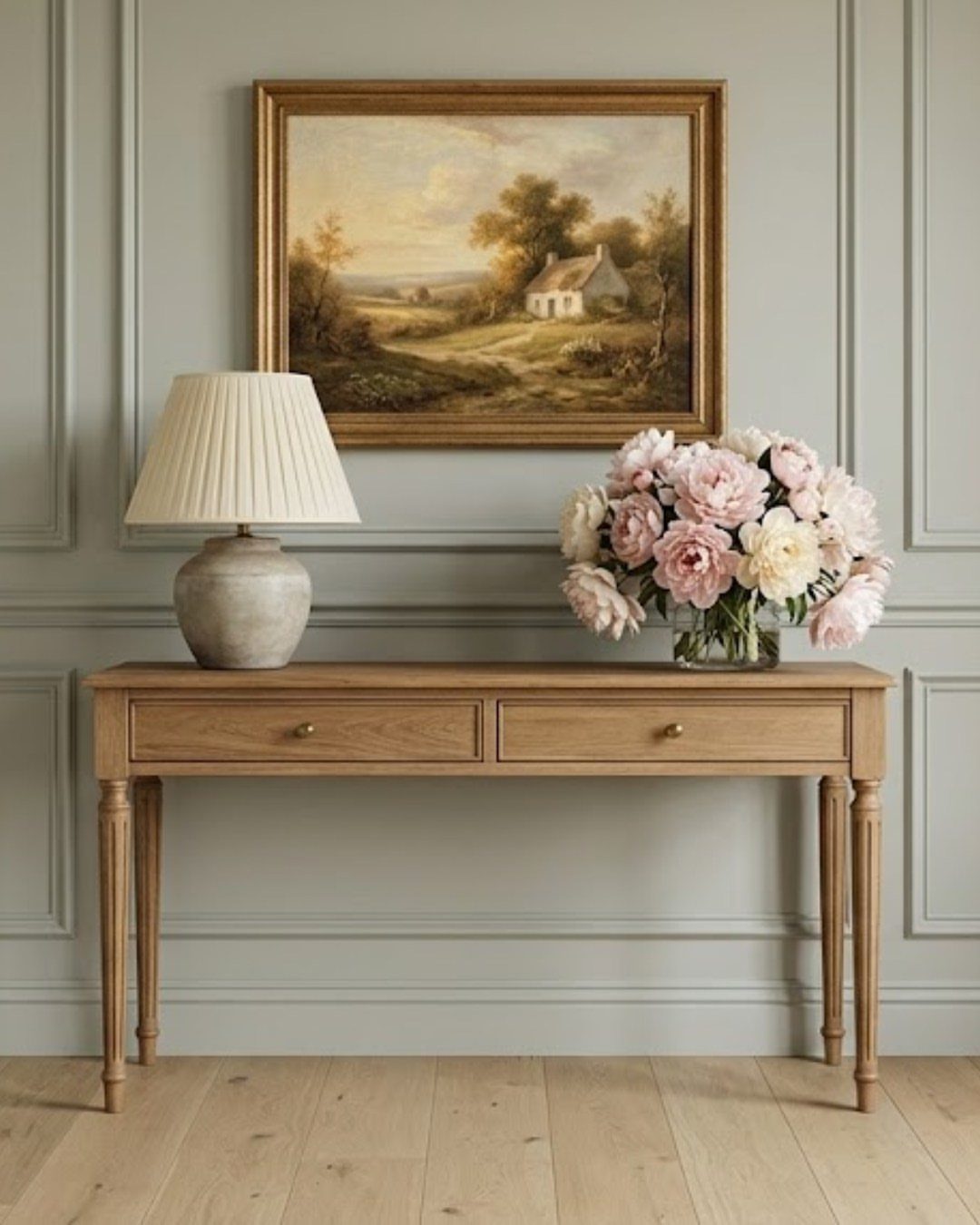
Paint the panels and the flat wall above them in the same color.
One shade across both looks calmer than two. A satin or eggshell sheen on the panel trim holds up better to wiping, and I would pick it over flat there.
Light wood furniture suits sage well.
3. Hale Navy Living Room Paint Colors
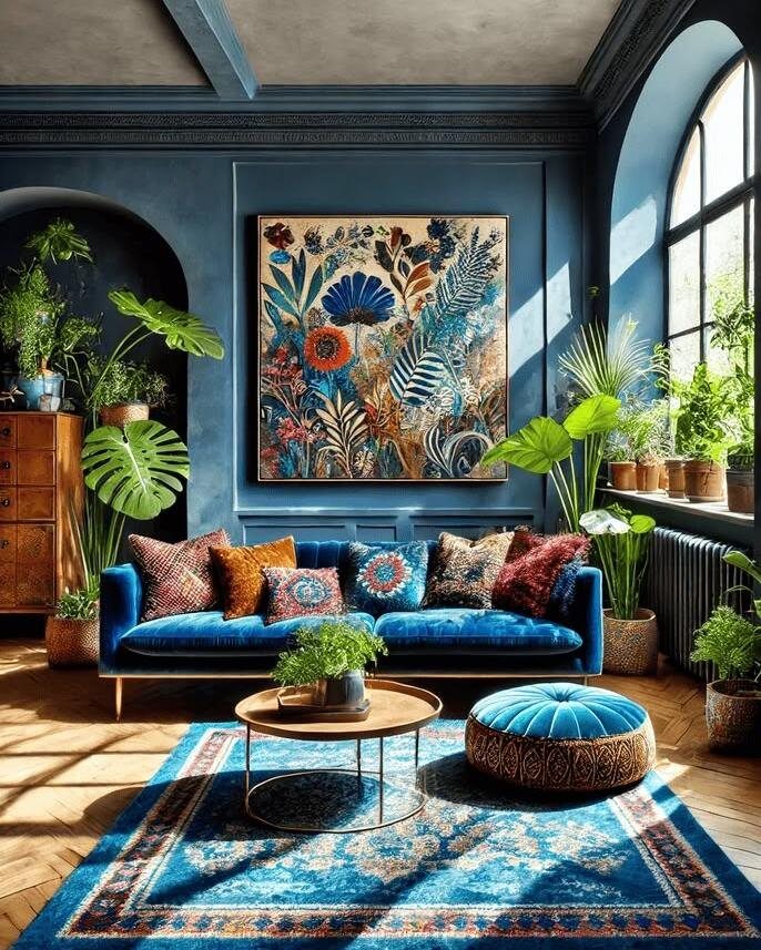
Hale Navy is a deep, saturated blue, and a room painted in it needs lighter things to push against.
Since the walls are this dark, keep the sofa in the same family. A velvet one in a slightly different blue adds depth without clashing.
Add lamps for evening, because navy absorbs light and can feel heavy with only one overhead fixture.
4. Deep Colors for Accent Walls
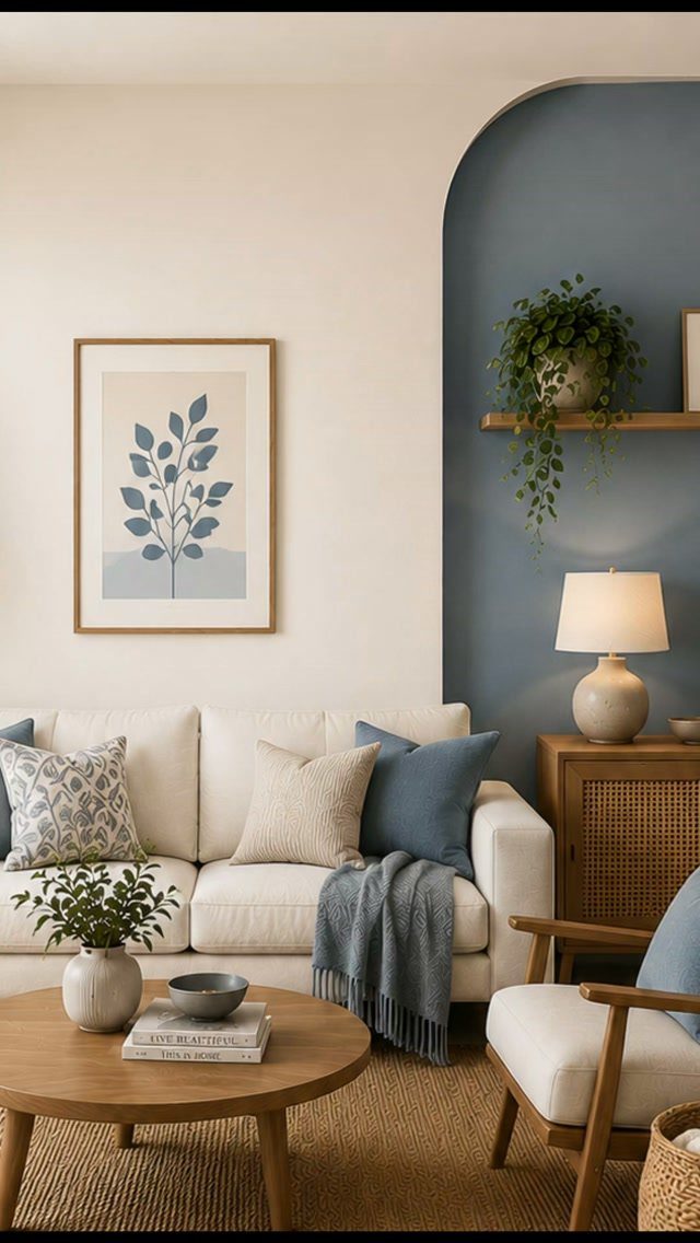
A deep blue behind a white sofa is a strong pairing, and an arched wall gives the color a shape to fill. One painted feature wall is a single-weekend project.
Pick the wall behind the seating, so the color frames what you see. Keep the other walls light so the room stays open.
Use painter’s tape for crisp edges around the curve, and I would do 2 coats of the deep shade for even coverage.
5. Muted Grey-Blue Living Room Walls
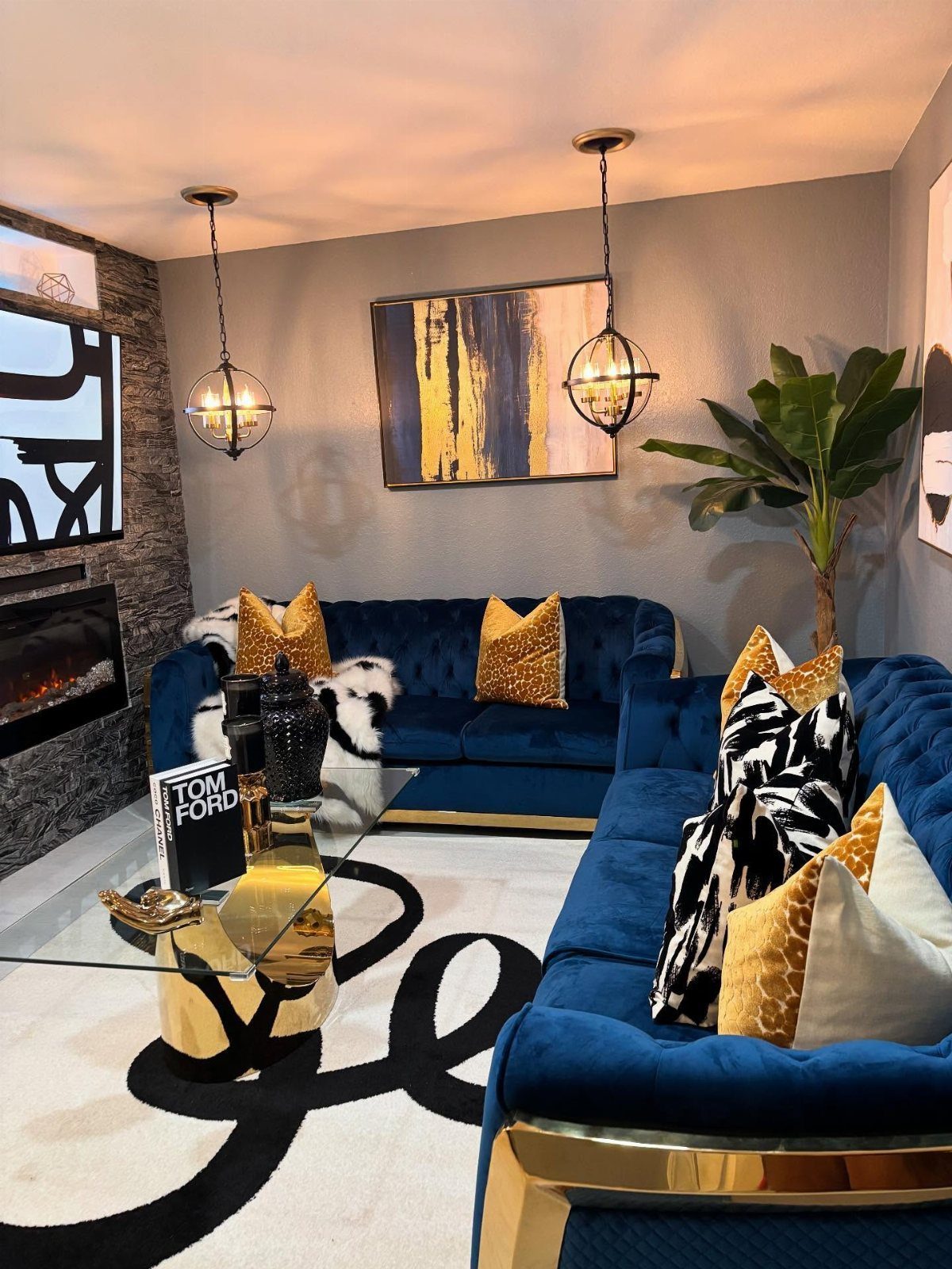
Grey-blue walls calm down a room that already has strong pieces, such as deep blue velvet sofas. The wall color sits quietly behind them instead of competing.
Gold accents work well here: a frame, a lamp base or a tray warm up the cool tones.
Choose a grey-blue with a visible gray undertone, not a bright sky blue, so it reads as muted next to the richer sofa color.
Sample it near the sofa fabric before committing.
6. Neutral Beige Living Room Walls
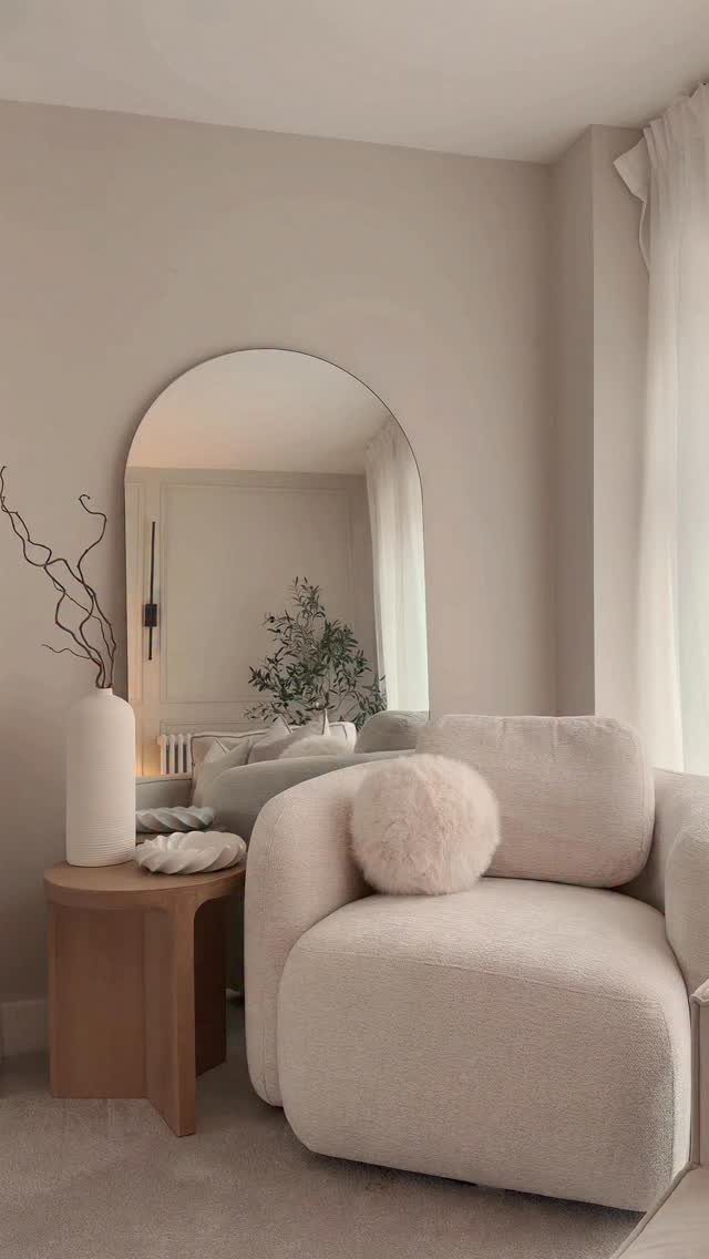
One good neutral beats a wall of swatches, though I’d still put up a sample or two before committing to the full gallon. Beige is a fine place to be decisive.
Pair it with cream upholstery and a wood side table, as in this corner, and the tones stack softly. A curved chair and an arched mirror add shape so the room doesn’t go flat.
Pick one sample, brush it on a large board, and judge it at night as well as noon.
7. Neutral Grey Living Room Walls
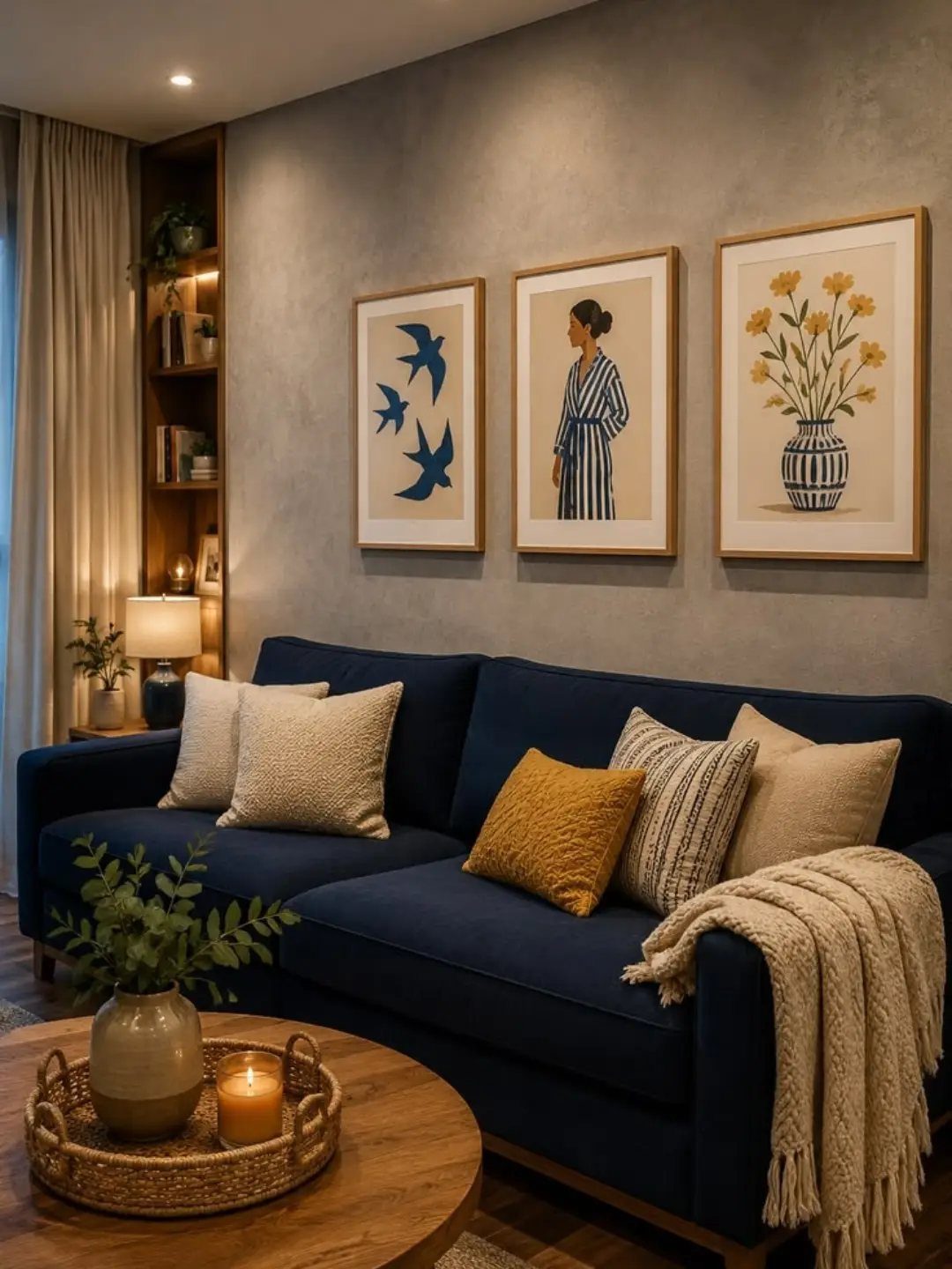
Navy against grey is a pairing that holds still: the wall stays out of the way and the sofa does the talking. Pick a mid-tone grey, not a pale one, so the navy doesn’t turn into a dark block.
Wood keeps the combination from going cold. A wooden coffee table, as here, and a plant or candle on top add warmth the 2 cool colors lack.
Hang the frames in a tight group above the sofa so the wall reads as one arrangement.
8. Crisp White Living Room Walls
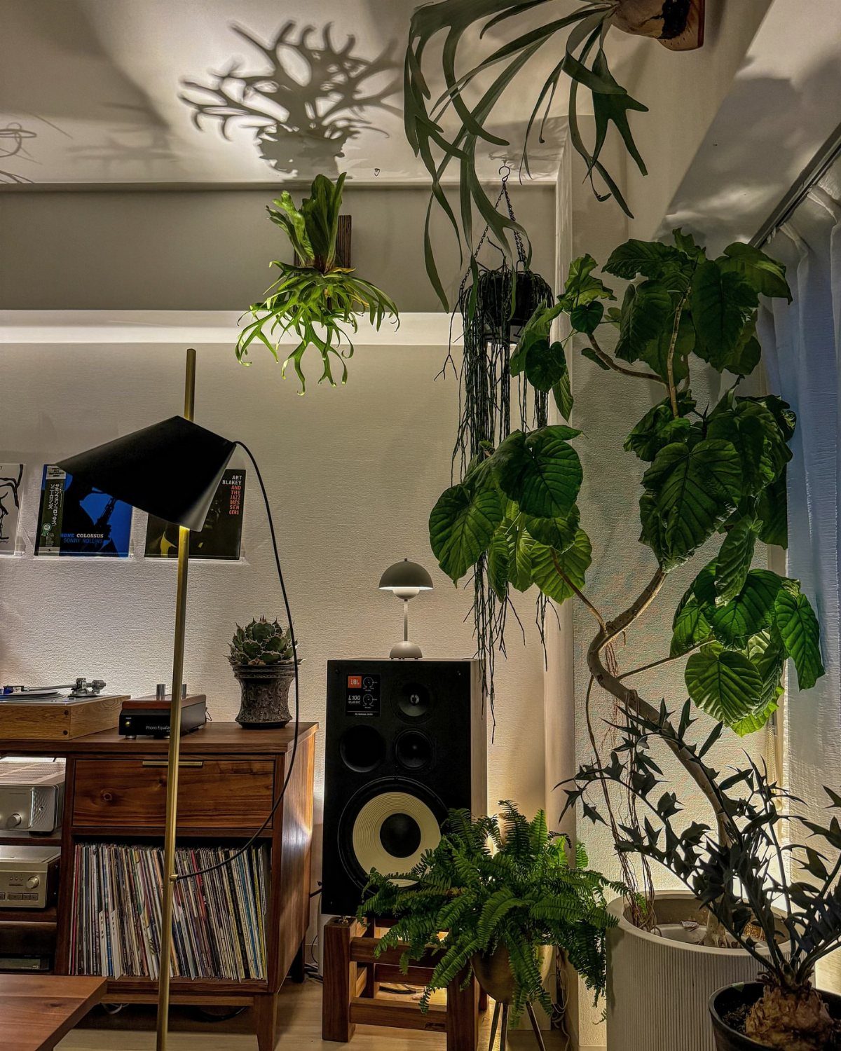
White walls make a good backdrop for green. Plants, both hanging and potted, read sharper against a crisp white than against almost any other color, and mid-century wood legs look lighter too.
Choose a clean white over a creamy one if you want that bright, gallery feel. Test a large patch beside your wood furniture, since white can lean cool or warm once something brown sits next to it.
2 coats cover most walls evenly.
9. Warm Off-White Living Room Walls
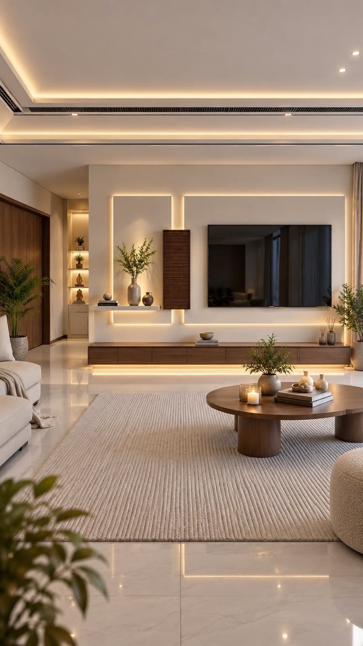
Warm off-white suits a room with a big TV, because it softens the dark screen instead of fighting it. Wood furniture and a beige rug stay in the same warm family, so nothing jumps out.
I would pick this over stark white for an evening room. Recessed lighting also gives the walls a gentle glow.
Brush a sample near the TV wall and check it after dark, when lamps change how warm the color looks.
10. Soft Light Blue Living Room
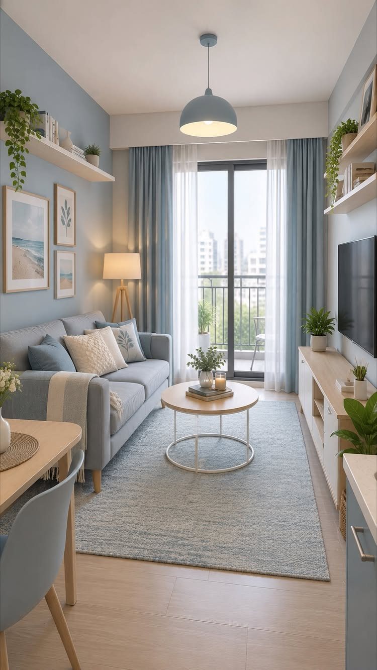
Soft light blue looks most cohesive when the sofa and curtains stay in the same family, as they do here. The room reads calm and unified, and light wood floors keep it from feeling cold.
Go a shade or two deeper on the sofa than the walls so the furniture doesn’t vanish into them.
Hang the curtains in a matching blue to tie the balcony door into the scheme. Sample the paint by the door, since daylight there will change how blue it looks.
Factors to Consider When Choosing Colors
Natural light decides more than any swatch name. Note which direction your windows face and how much daylight actually reaches the walls, because a color that glows in a north-facing room can look flat in a south-facing one.
Look at what stays put: flooring, fixtures, artwork, and the furniture you plan to keep. Pull your color from one of those pieces and the walls will already have something to match.
Room size and mood count too. Decide whether you want the space to feel calm, cozy, or bright, then choose the color that gets you there.
A swatch looks different once your lamps, rugs, and window light surround it, so test a sample on the wall before you buy a full gallon.
If you plan to replace a sofa or rug soon, choose that piece first or at least alongside the paint, so the 2 decisions work together.
Best Paint Finishes for Living Rooms
For most living rooms, the choice comes down to 2 finishes: satin and eggshell. Both stand up to scrubbing better than flat paint, which matters near a sofa where hands and shoulders brush the wall.
Eggshell has a softer, lower shine and hides small wall flaws better.
I would pick eggshell for walls in a rental or an older home with uneven plaster, and satin for a family room that gets heavy use.
Whichever you choose, buy the same finish for the whole room so the walls read evenly under lamps.
Color Trends for 2026
Gray has been losing ground to warmer tones and richer colors, and the 2026 palettes lean that way. Deep jewel tones and soft neutrals both fit the shift.
If you are repainting a gray room, a warm neutral is the easiest first step, and it works with the sofa and rug you already own.
One exception to the warm direction is Pantone’s Cloud Dancer, a very white shade. It suits a room that wants a clean, bright backdrop.
Popular living room colors from Benjamin Moore include October Mist 1495, Revere Pewter HC-172, and Gray Sky 2131-70. Softer hues like these create a welcoming room for guests.
Buy a sample of any trend color and live with it for a few days before painting the whole room.