Whether you rent decides most of this list: paint, nail holes and wall panels all hinge on what your lease allows, so the ideas split between plug-in sconces, removable options like mirrors, and permanent changes like fastened wood strips, floating shelves or a painted accent wall.
The range runs from a copy-shop gallery wall that costs little to a TV lift cabinet that costs far more than a basic stand. Whatever you pick, scale it to about 2/3 the width of the furniture below it.
1. Wall Panels
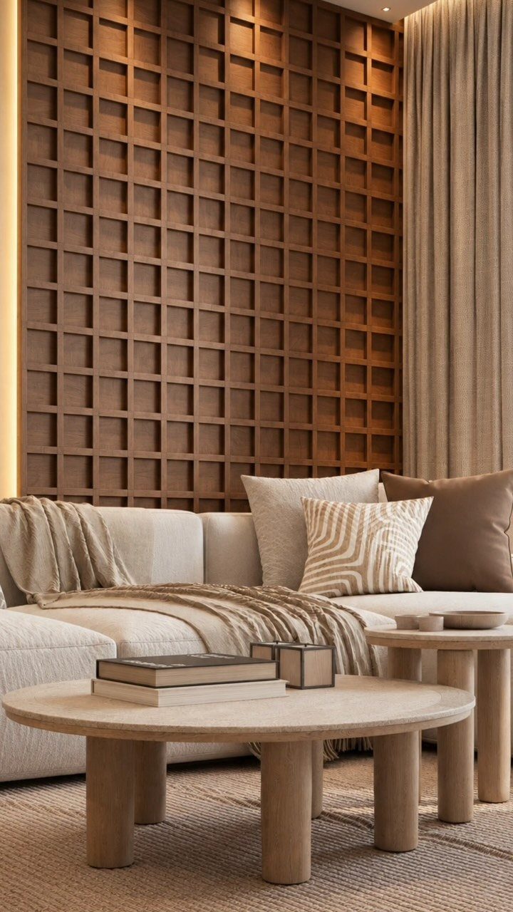
Slim wood strips set in a grid give a flat wall depth without a single coat of bold paint. Behind a neutral sofa, the brown tone does the work of a headboard, framing the seating and warming a pale room.
Panels suit anyone who wants architecture a builder never supplied. Pick one wall, usually the one behind the sofa, and leave the other three plain so the grid stays the focus.
Before buying, check whether your lease allows fastening into the wall. If it does not, ask about freestanding or lean-style options instead.
2. Gallery Wall
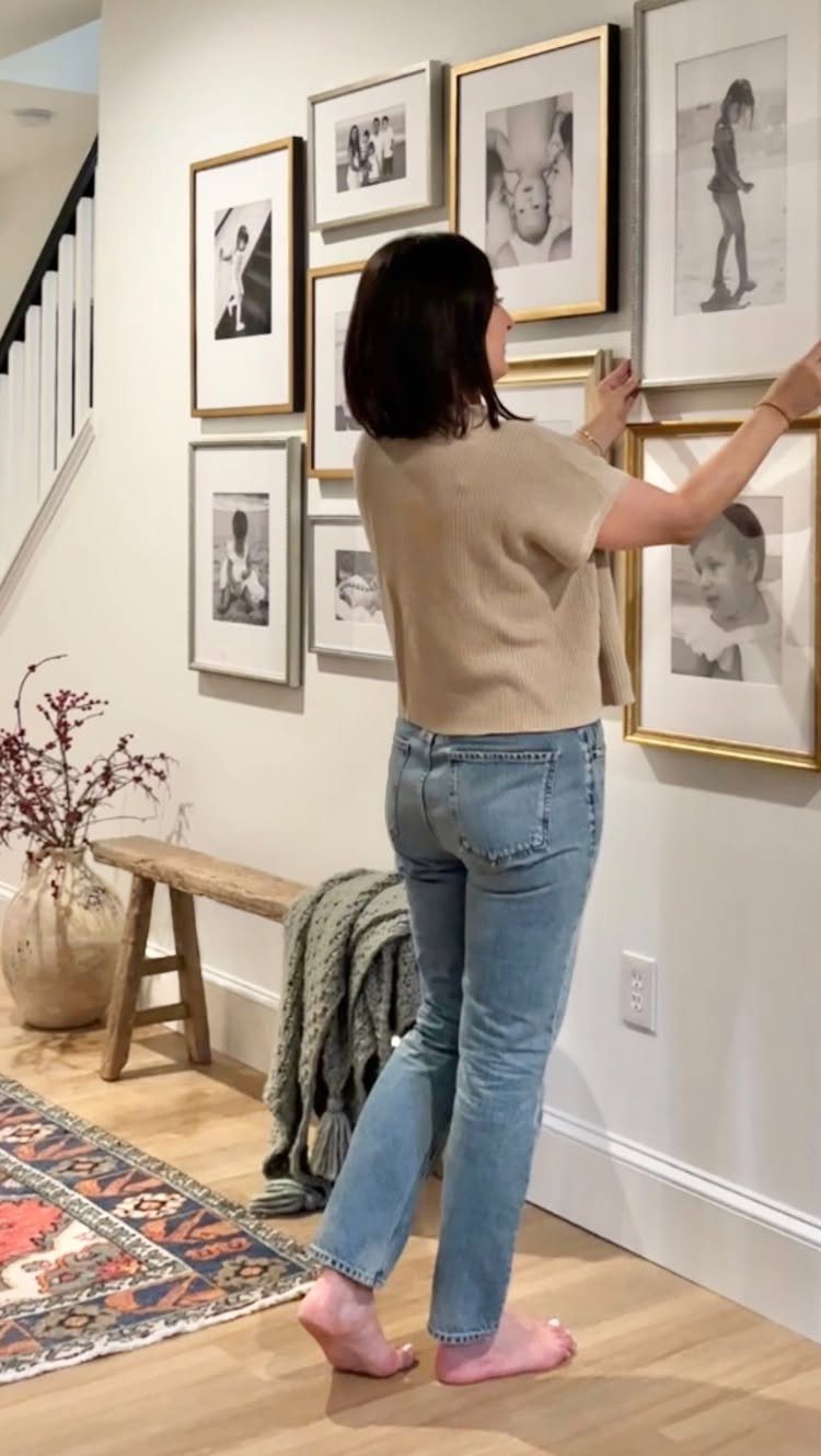
Black and white photos make the easiest gallery wall to pull off, because matching tones let mixed frame sizes look planned. Family prints, travel shots and thrifted finds all sit together once the color is shared.
Cut paper templates for each frame and tape them to the wall first.
Shift them around until the spacing feels even, then hang from the center outward. Tape cost is pennies, and nail holes you never had to patch are worth more.
Printing at a copy shop keeps the whole gallery wall affordable.
3. Oversized Artwork
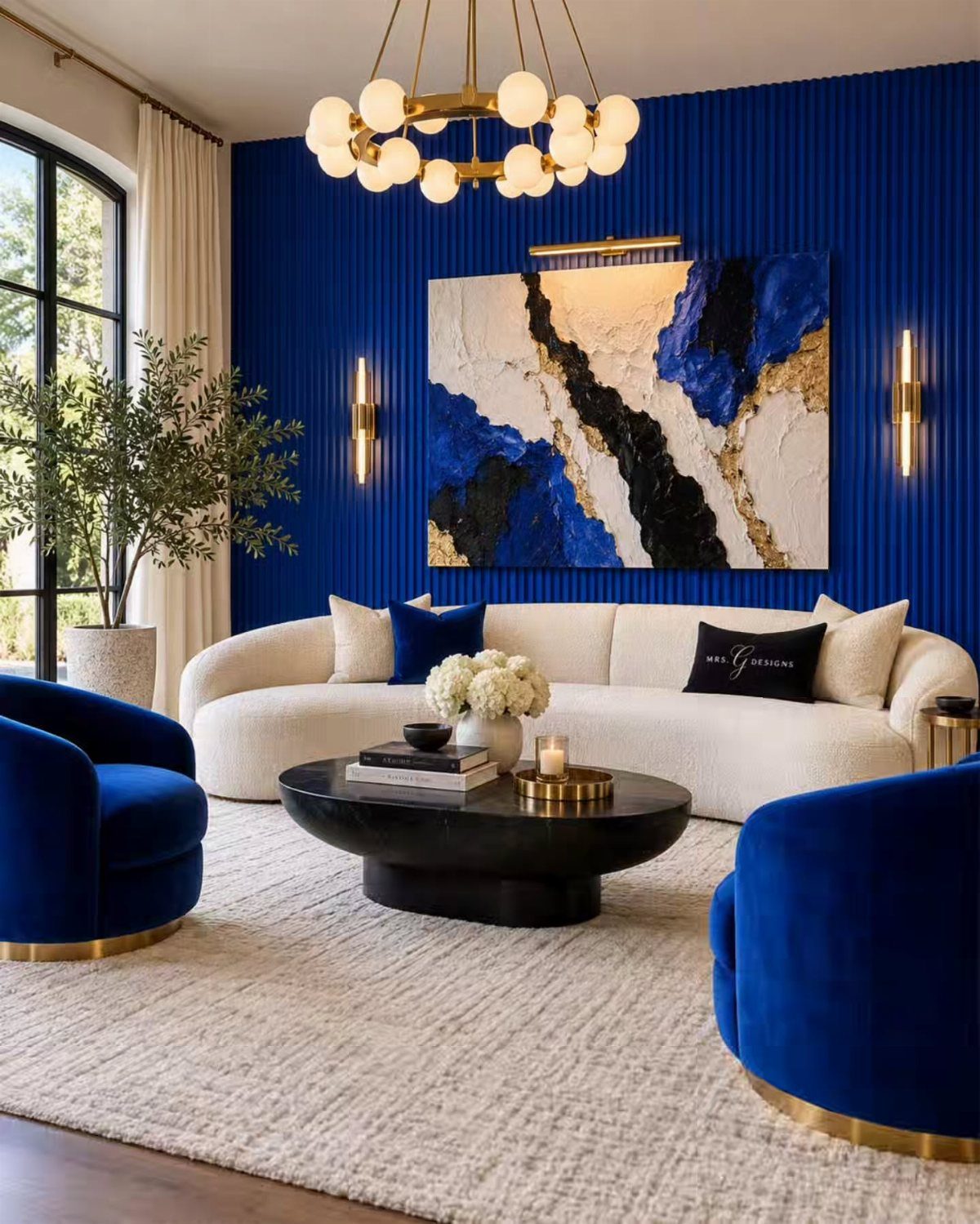
One big painting beats a cluster of small ones on a wall that needs a lead.
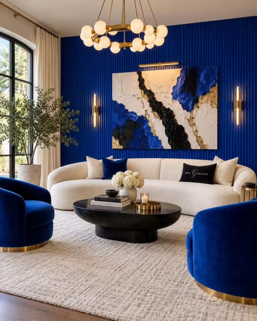
A large abstract in blue and gold, set against a deep, ribbed wall in a similar shade, reads as a deliberate choice rather than decoration.
Choose a piece that picks up 2 colors already in the room, such as the chairs and an accent. Large canvas prints cost far less than original work, and you can hang them in an afternoon.
Heavy canvases need wall anchors or a stud, so check the hanging hardware’s weight rating before you commit.
4. Statement Mirrors
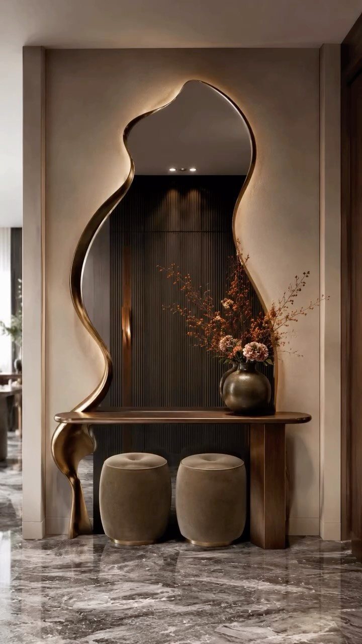
A mirror with an irregular, organic outline works as sculpture, and a backlit one adds a soft glow after dark.
Over a console table, it bounces light across the room and makes a narrow entry or small living room feel wider.
Hang it so the bottom edge sits a few inches above the console, and keep the table styling simple: a vase, maybe 2 seats tucked underneath.
I lean toward gold frames in a neutral room because the warm metal shows up without clashing. Place the mirror opposite a window to catch daylight.
5. Art Above Furniture
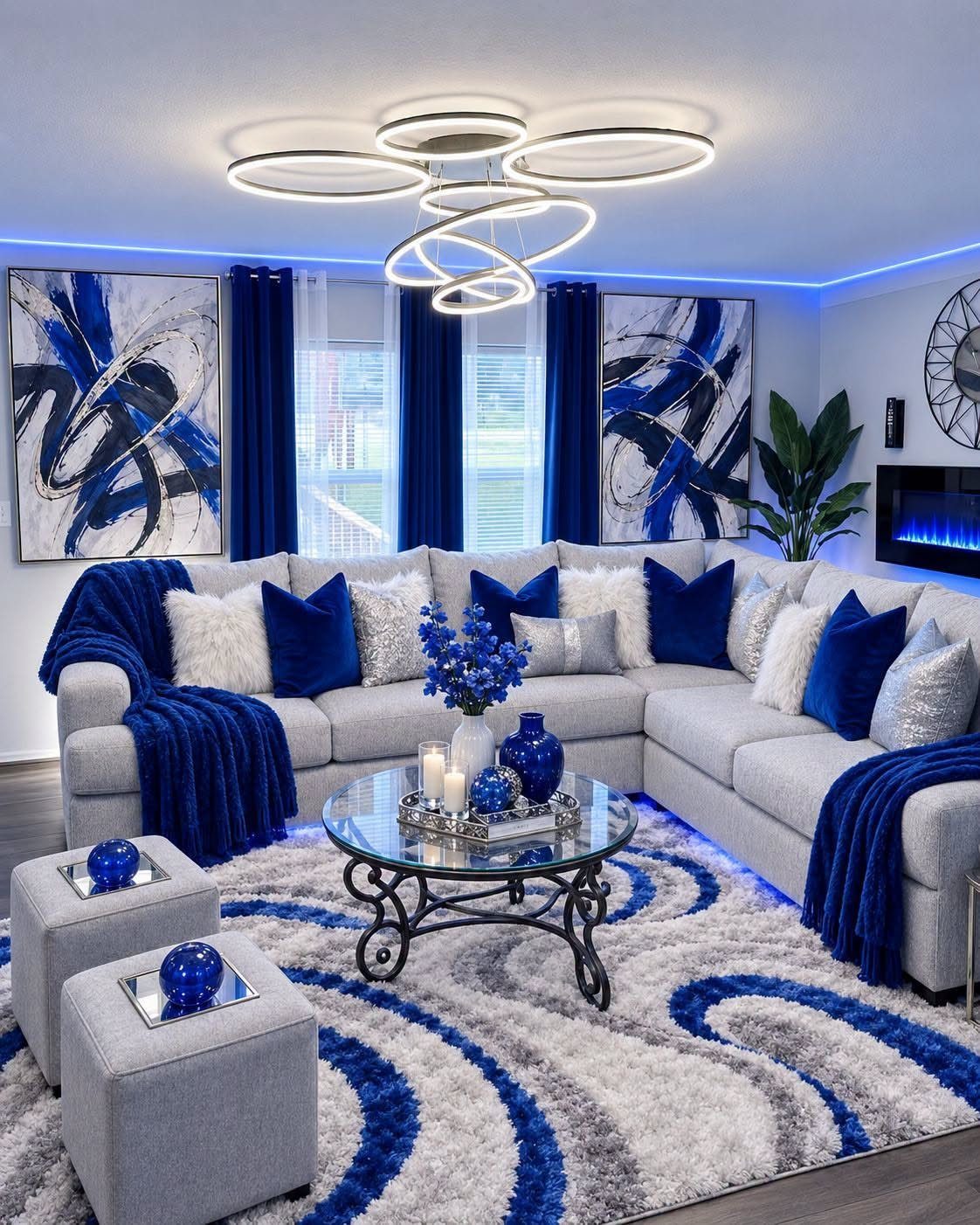
2 paintings hung side by side over a sectional tie the wall to the furniture below.
Hang them so the pair’s center sits at eye level, and keep the gap between frames small, around 2–3 inches, so they read as one group.
Stop the artwork short of the sofa’s full width. Two-thirds of the sofa’s length is the standard, and it keeps the wall balanced without crowding the ends.
A matching blue palette makes the pair feel intentional, and it picks up the pillows nicely.
6. Statement Art Above the Fireplace
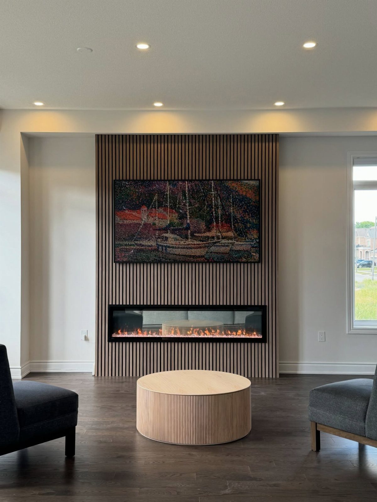
Above a fireplace, the art has to hold its own against the fire, so scale up. A wide painting centered over a linear fireplace, set into a wood-slat wall, fills the space and draws the eye straight to the hearth.
Match the width to the fireplace, or go slightly narrower, so the 2 read as a unit. A large mirror also works here if you want light more than color.
One caution: check how much heat the fireplace gives off before hanging anything, since canvas and frames can suffer from constant warmth.
7. Wall Sconces
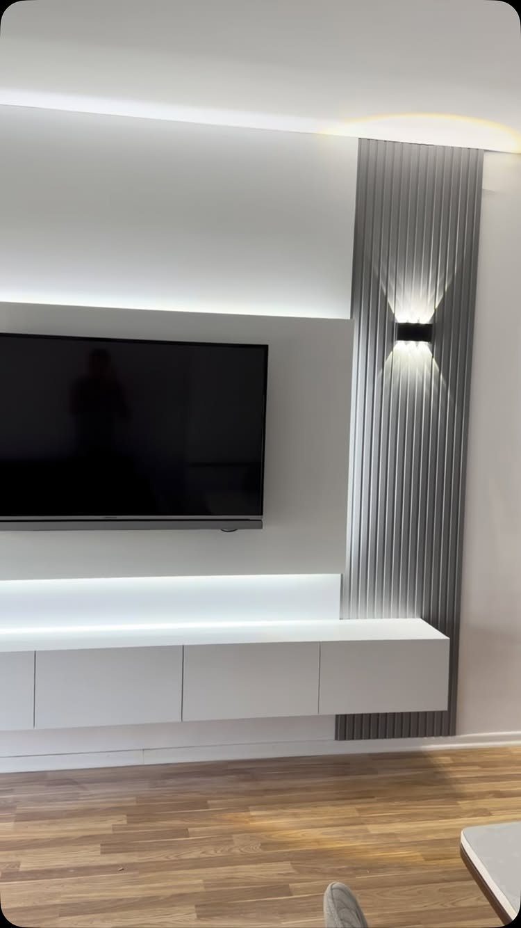
A sconce that throws light both up and down turns a slatted wall into a light feature. The beams graze the vertical lines and show off their depth, which a flat ceiling fixture never does.
Set it at a spot the TV and console leave open, so the glow has room to spread. A black finish stands out against grey and reads as a deliberate accent.
Plug-in versions with a cord cover suit renters who can’t hardwire. Picture lights work the same way over a framed piece.
8. Use of Color
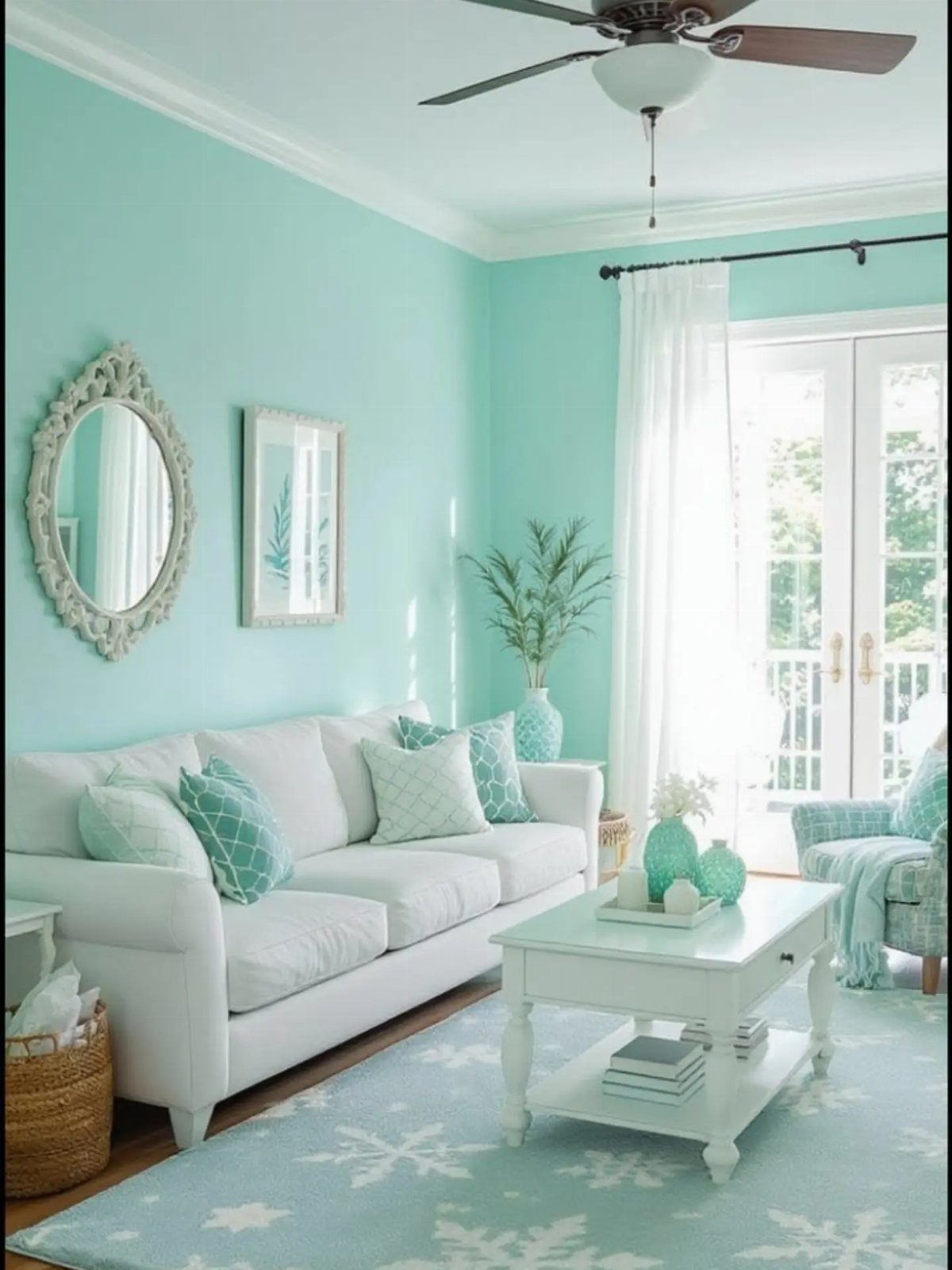
Turquoise on every wall is a bold move, and white furniture is what keeps it from swallowing the room. The sofa and coffee table stay quiet while the walls carry the color.
Echo the shade in a rug and a few accessories, as the light blue rug does here, so the color feels planned.
Paint is the cheapest big change a renter can make, though most leases ask you to repaint before moving out. Test a sample patch first, because strong blues shift a lot between daylight and lamplight.
9. Vintage Tapestries
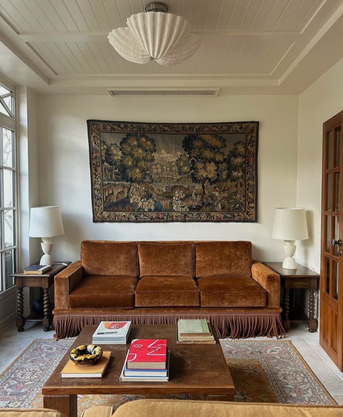
Hang a large woven landscape over a brown velvet sofa and the wall gets warmth and texture that a flat print can’t match. Against plain white paint, the piece becomes the one soft, layered thing in the room.
Pick one big piece instead of several small ones, and center it over the sofa. A wooden rod or clips along the top edge hold the weight evenly and avoid stress on the weave.
Vintage finds at thrift shops and estate sales keep the cost low.
10. TV Lift Cabinet
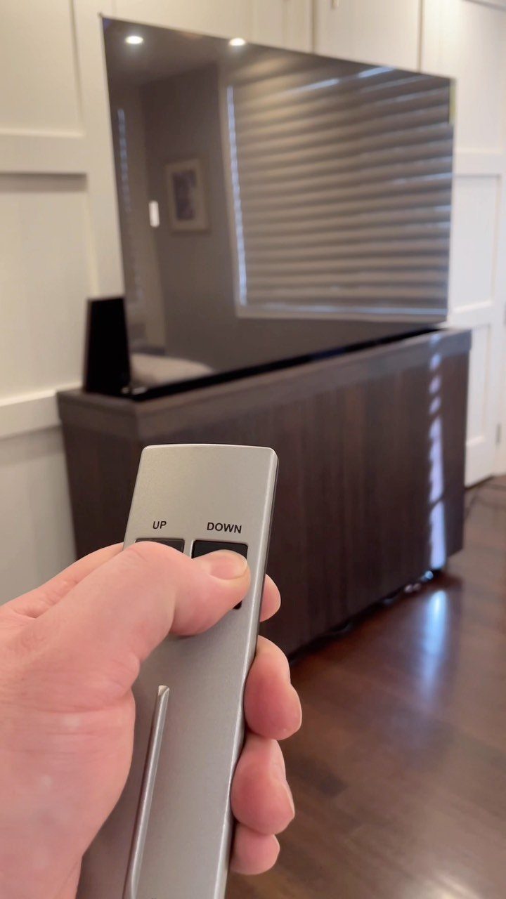
A TV that rises out of a dark wood cabinet at the press of a remote lets the living room look like furniture first and screen second.
When it’s down, the cabinet is just a handsome piece with a closed top.
I prefer this to open shelving when you want clean surfaces and hidden storage in one unit. Measure your TV’s height against the cabinet’s interior before buying, since the screen has to clear the lid fully.
Expect it to cost far more than a basic stand, so it suits a patient budget.
11. Floating Shelves
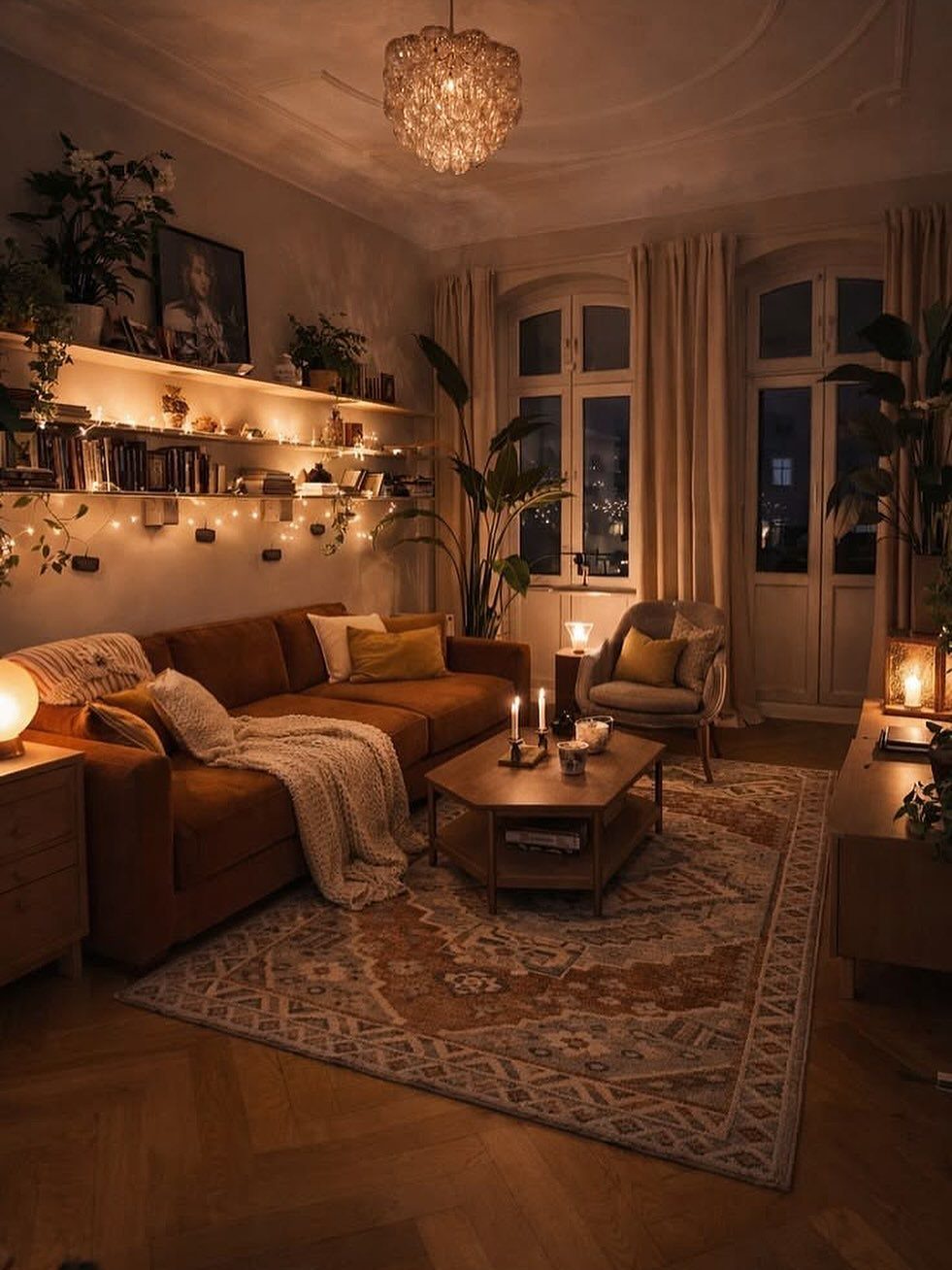
Floating shelves give a wall a place for books and plants without any furniture taking up floor space. Above a leather sofa, a few shelves of mixed heights hold the whole display.
Stack books both flat and upright, then add a trailing plant so the line stays soft. A string of fairy lights tucked along the back edge gives off a warm glow at night.
Anchor into studs for anything heavy, because books add up fast. Check the bracket’s weight rating before loading.
12. Stacking Art Pieces
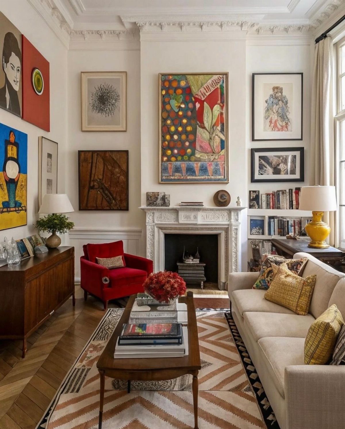
Stacked frames in a vertical column make a quick vignette on white walls, and they suit tight spots beside a fireplace. Going up instead of out keeps the display slim.
Hang the pieces with equal gaps between frames and line up their edges. Mixing sizes adds interest, and a red armchair nearby is a good cue for pulling one accent color into the art.
Paper templates on the wall help you test the spacing before any nails go in.
As Maggie Griffin of Maggie Griffin Design in Gainesville, Georgia, says, “Living room walls should have a balance of art pieces.”
Sizing and Placement Fundamentals
Size your wall art to about 2/3 the width of what sits below it. Above a 7-foot sofa, that puts you around 56–60 inches wide.
Space it 6–8 inches above the furniture so the two feel like they belong together.
With high ceilings, resist hanging art up near the crown molding.
It pulls the piece away from the seating and makes you crane your neck. High ceilings call for vertical pieces or stacked frames, not artwork hung halfway to the ceiling.
Measure your sofa first, then multiply. Cut paper templates to size and tape them up before you buy anything.
Mixing Materials for Designer Results
Mixing materials gives a wall the collected-over-time look. Matte canvas next to a glossy acrylic print, or warm wood beside cool metal, adds contrast that one medium can’t.
Canvas brings texture and warmth. Acrylic has a glass-like surface and strong color.
Metal prints hold color well and stand up to handling. Woven hangings, shadow boxes and sculptural pieces add depth.
Give the mix a common thread so it doesn’t look random.
A shared color palette is the easiest one. Matching frames or mats pull a group together, or let a shared subject do that work when the frames differ.
Spread the pieces evenly around the room instead of piling them onto one wall. That keeps any single area from feeling overloaded.
Current Trends in Wall Decor
Current wall decor leans toward texture you can feel as much as see. Texture is doing the work now: plaster relief, dimensional wallpaper, tile, wood paneling, all of it restrained.
Natural, organic finishes are replacing the single loud accent wall. They soften sound and read as calm, and wood paired with linen is a combination I’d expect to see more of.
Lighting matters too. Instead of relying on a basic linear LED strip, use fixtures that pick out specific pieces, so the decor gets highlighted at night.
Go with a single oversized print or hang 2 big pieces side by side.
Frequently Asked Questions
How can I make my living room walls look nice?
Give the room one lead piece, such as a single large painting, a gallery wall or a wall with texture, and keep the other walls quiet. Texture can come from wood slat panels, a big woven hanging or plaster-style finishes.
A shared color across everything on the wall makes mixed pieces look planned. Pull 2 colors from what’s already there and look for art that uses both.
How big should wall art be above a sofa?
Aim for about 2/3 the width of the sofa.
Hang it 6–8 inches above the furniture so the two read as one group. Tape up paper cutouts at the right size before you commit to anything.