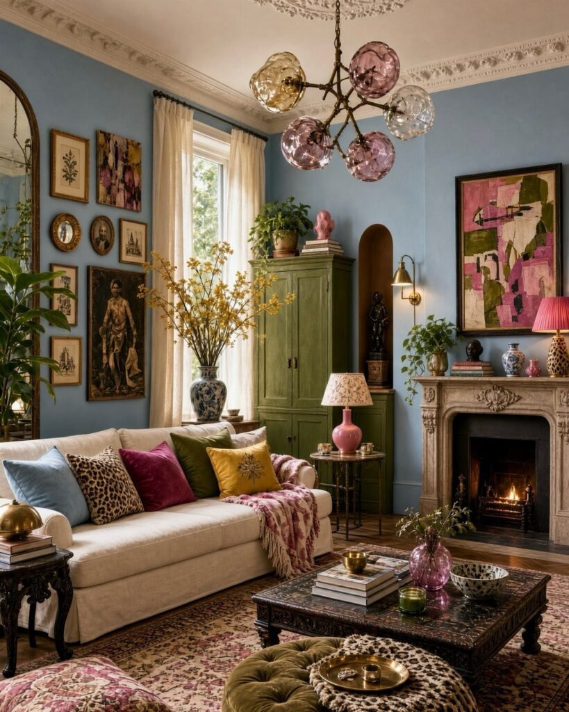
Whether you can paint decides how you approach these schemes: owners can commit to a deep umber brown on walls and sofa alike, while renters can get the same pull from curtains, pillows, a rug or a pair of navy chairs.
1. Pink-based Warm Neutrals with Dark Wood Finishes
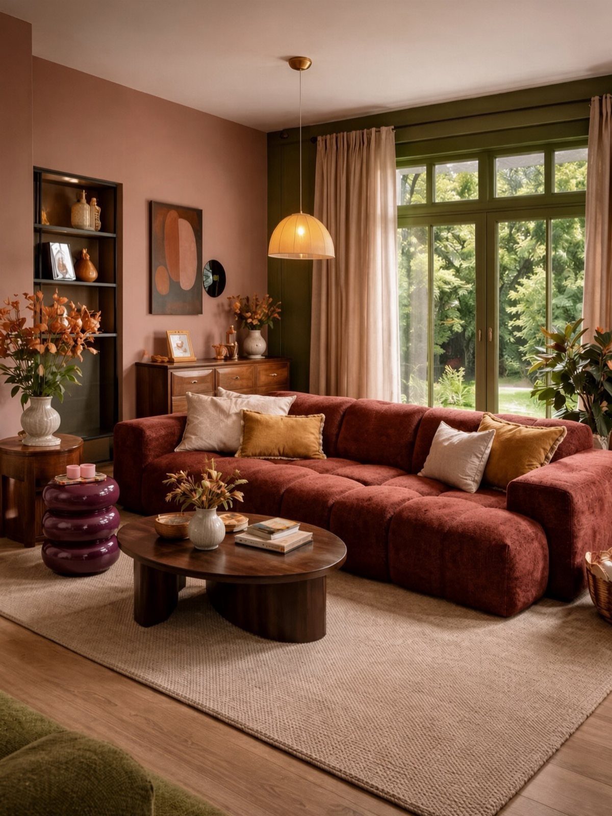
Dusty pink walls work best when the sofa and wood pull toward red and brown instead of cool gray.
A reddish-brown velvet sofa against pink reads as one warm family, and the dark wood coffee table and bookshelf give the soft wall some weight.
I would keep the pink muted, closer to clay than bubblegum, so the wood stays the star. A window with greenery outside adds a cool counterpoint for free.
Test a large paint sample on the wall for a few days before committing, since pink shifts a lot with daylight.
2. Inky Blues with Light-colored Furniture
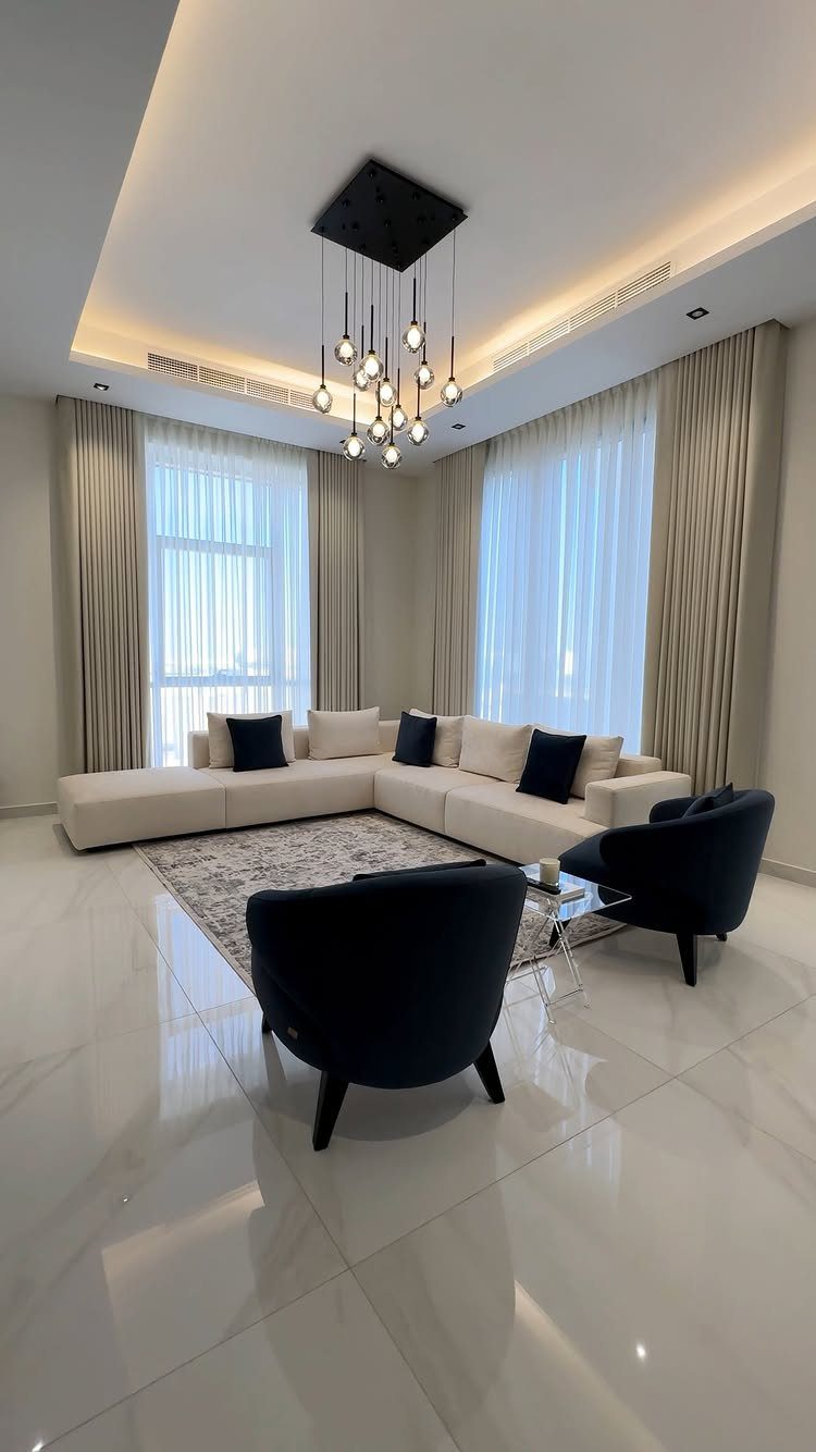
Navy accent chairs beside a cream sectional give you the drama of deep blue without painting a single wall.
That is the version I would pick on a renter’s budget: 2 dark chairs do the work of a whole color scheme.
Keep the big pieces light, then let the blue repeat once or twice more, in a pillow or a vase. A gray rug and beige curtains sit quietly between the two, so nothing fights the chairs.
Dark upholstery shows lint and pet hair more than cream does, so keep a roller nearby.
3. Vibrant Botanical Colors
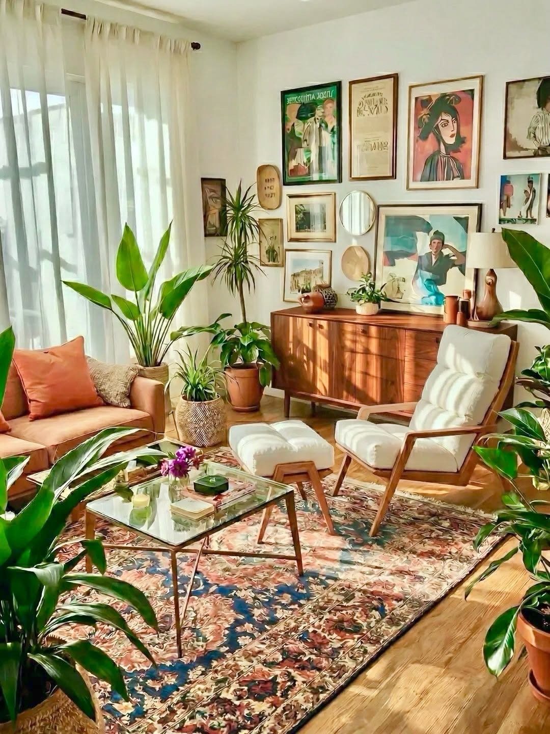
Green plants do the heavy lifting in a botanical scheme, and a patterned rug with a few bold colors keeps the room from feeling like a greenhouse. Wood furniture, like the sideboard here, is a natural partner.
Start with the rug, since it sets the palette, then pick plants in a few sizes so the leaves fill low, middle and high spots. A white armchair gives your eye somewhere calm to land.
A gallery wall can pull a color or two from the rug. Plants are the cheapest way to add color, and you can add them one at a time.
4. Timeless Neutral Color Schemes
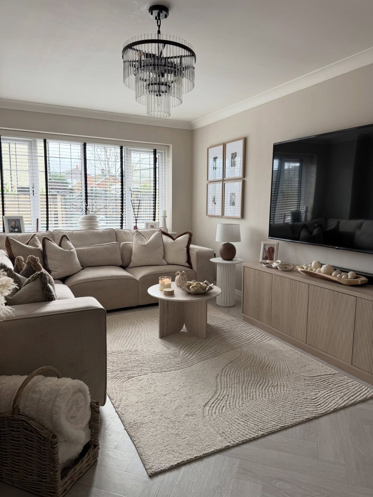
Beige, cream and light wood make a backdrop that stays put while everything else changes. A neutral sectional and a textured rug carry the room, so texture has to replace contrast.
I’d choose a rug with visible weave and keep wood tones light, like the console. A large chandelier then becomes the one statement piece.
Swapping pillows, throws or art later gives you a new look without replacing furniture, which suits a weekend budget well.
5. Monochromatic Schemes
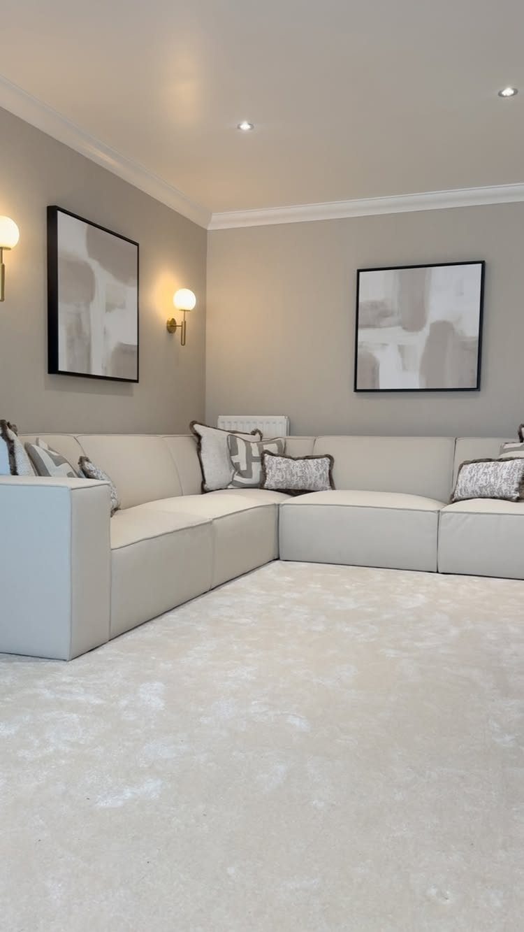
Monochrome works when you stack shades of one color, here a soft beige, across sofa, carpet and walls. Differences in tone are what keep it from looking flat.
Choose two or three steps lighter and darker than your main color instead of matching everything exactly. Abstract art and wall sconces add shape and shadow without adding another hue.
Matching too closely is the risk: a room with one shade everywhere can feel like a waiting room. Vary the fabrics, such as a nubby rug against a smoother sofa, and the shades start to read as layers.
6. Scandi Grey
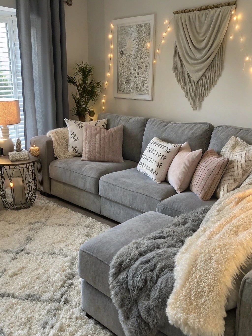
The blue-gray tint is what makes it feel calmer than plain gray.
Pink pillows, as in this room, are a small, swappable accent that warms the cool palette. Layer throws and pillows in a few textures, then add a plant and a side table to finish.
I like this one for renters: nothing here needs a paintbrush, so the whole look can change with a trip to the linen aisle.
7. Umber Brown
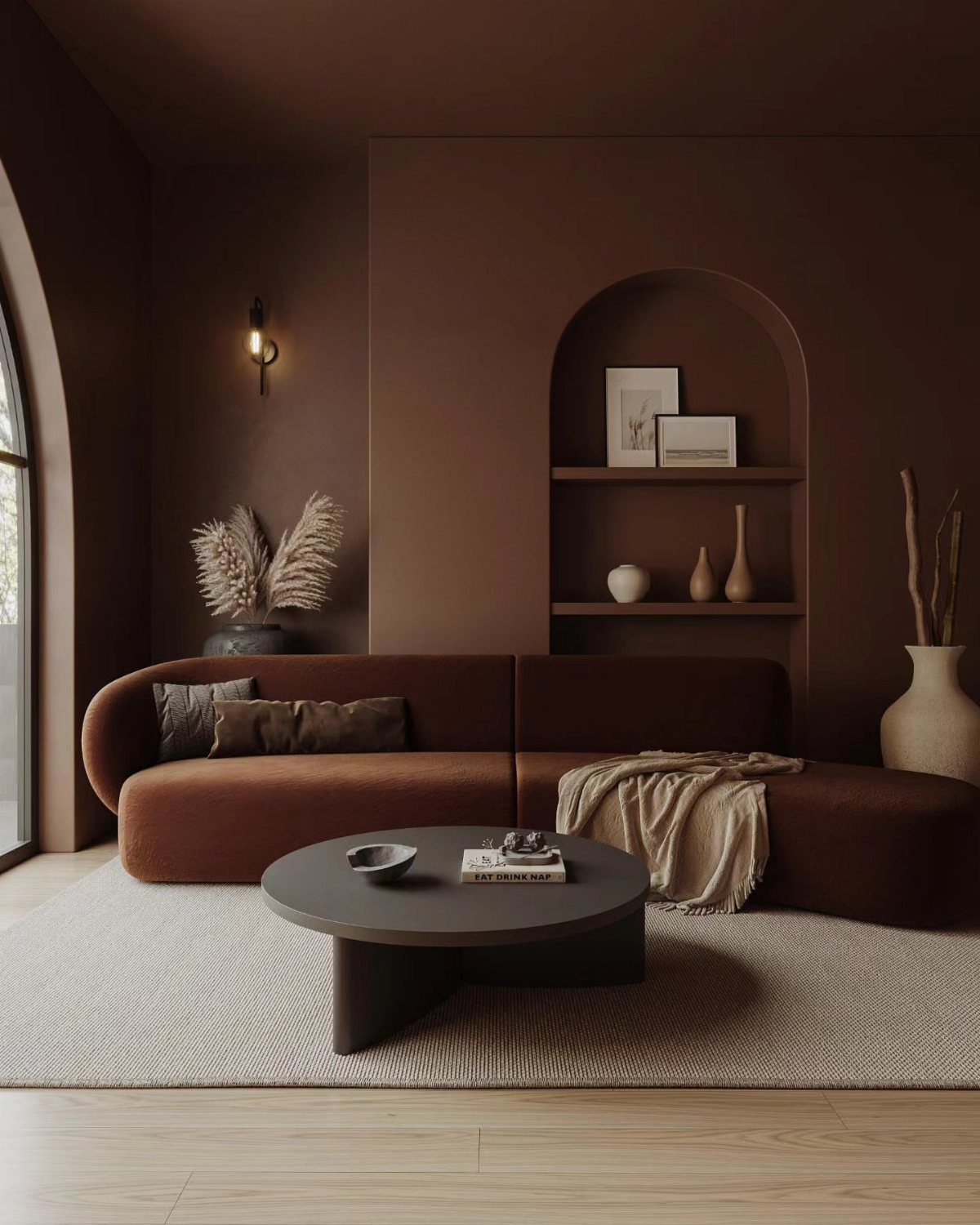
Pentland from Craig & Rose is a shaded umber brown, and painting walls and sofa in nearly the same tone makes the curved shape the star of the room.
A black round coffee table gives the brown a crisp edge to push against.
I would pick this over a gray if you want a retro mood without orange or avocado. Keep the shelf in the arched niche sparsely styled, a few books and one object, so the brown stays calm.
Test the paint on a large sheet first, since deep browns shift in lamp light.
8. Fresh Mint
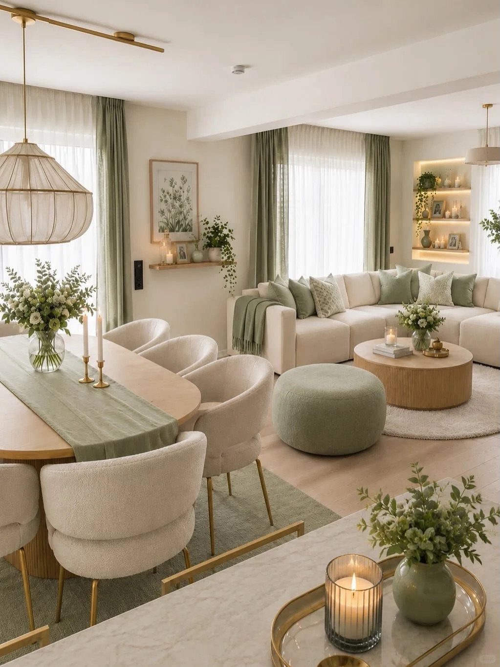
Mint works best in a living room when it stays on the textiles. Curtains, a table runner and a pouf in a soft minty green sit easily against cream furniture, and gold accents warm the cool tint.
I like that a renter can get the whole effect without paint.
Start with curtains, since they carry the most color, then repeat it once in a smaller piece.
9. Dark and Moody Colors
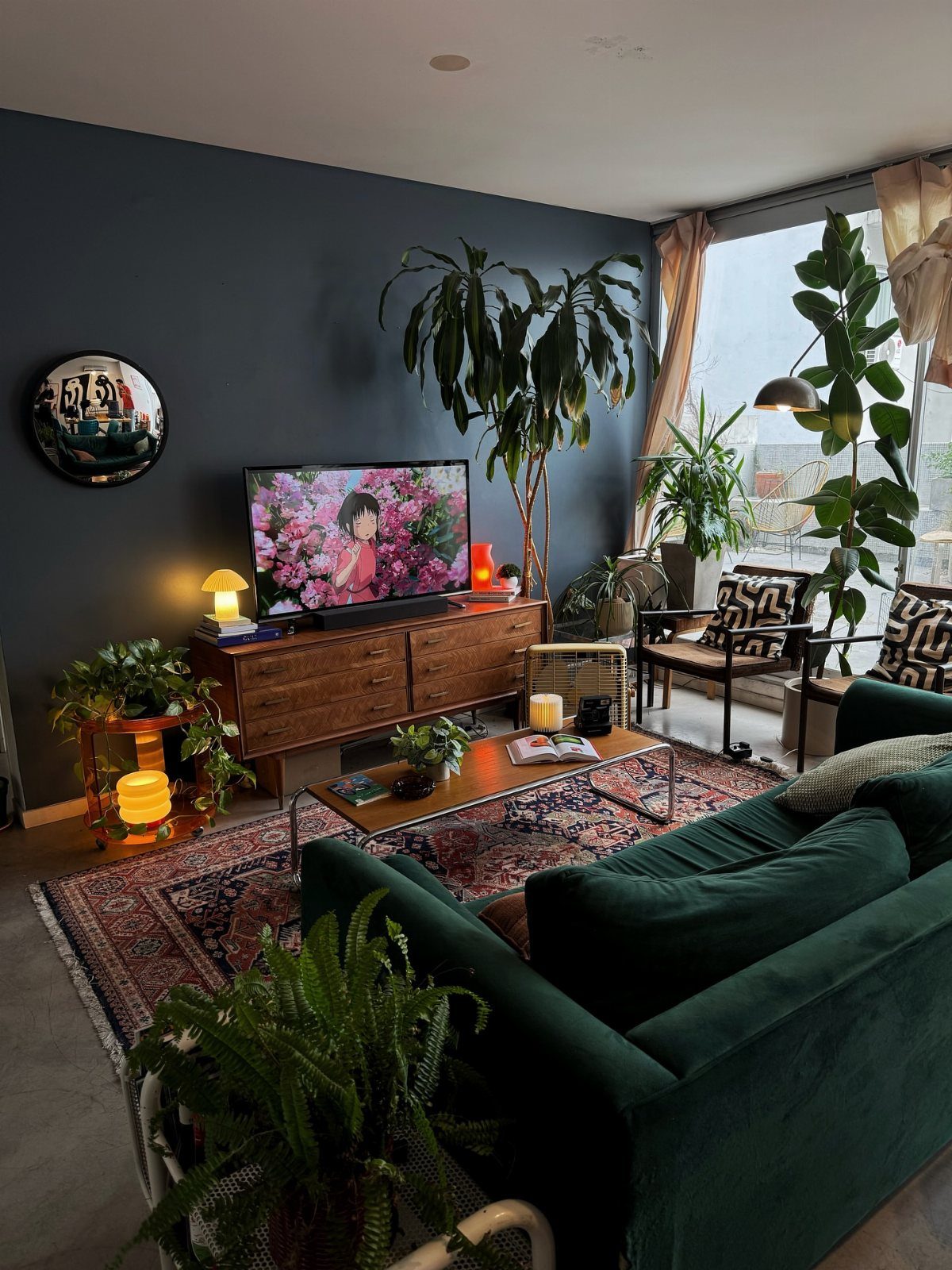
Velvet catches light, so the sofa does not disappear into the dark backdrop.
Plants help because their leaves bring fresh green and stop the space from closing in.
I would choose one dark wall first and judge it for a week before painting more.
10. Beige and Vibrant Orange
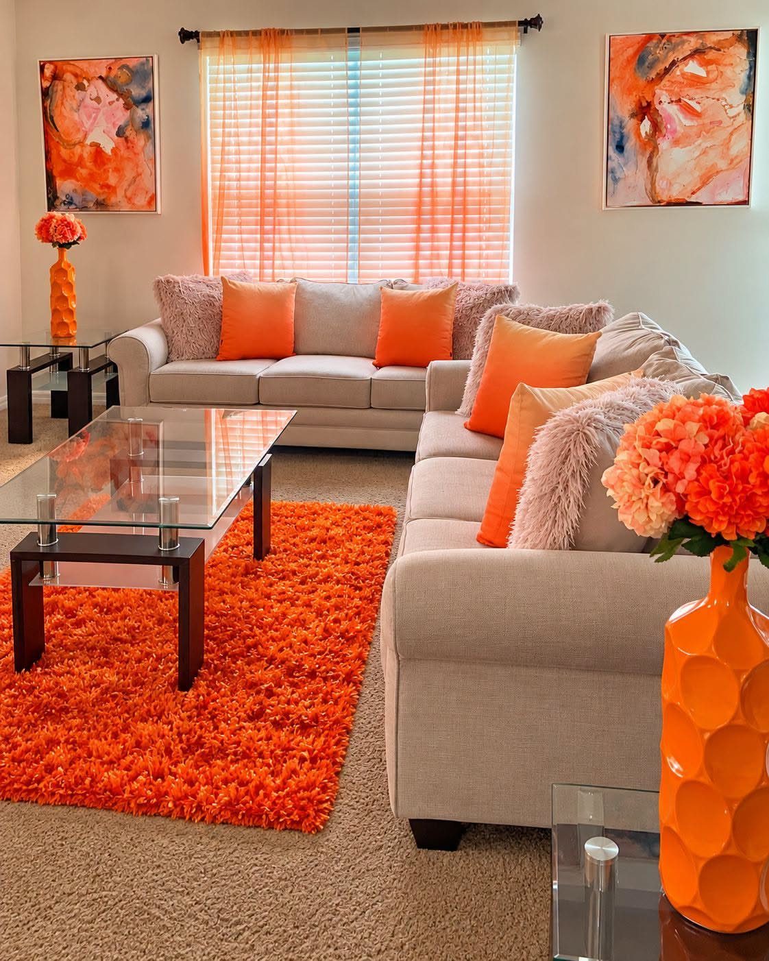
Orange against beige is a bargain approach: the sofas stay neutral, and the color lives in pieces you can swap.
A shag rug, curtains, pillows and a few floral arrangements repeat the same orange, so the room reads as planned instead of busy.
Stick to one orange, because mixing several shades looks accidental. White walls with 2 abstract paintings in matching orange tie the wall to the floor.
Start with the rug and pillows; if the orange feels like too much, they are easy to remove.
11. Magenta and Eclectic Jewel Tones
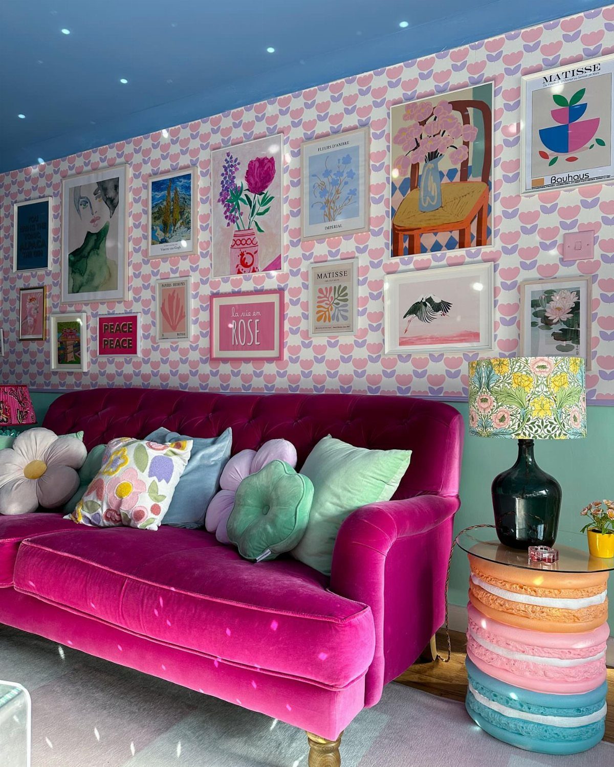
A magenta velvet sofa can handle patterned pink wallpaper if the pillows borrow colors from the walls and art. Pink on pink sounds risky, but the sofa’s deeper tone keeps it from blending in.
A blue ceiling gives all that saturation somewhere to settle.
Choose one loud piece, either the sofa or the wallpaper, and build everything else around it. Wallpaper is the costly commitment, so renters can try peel-and-stick.
12. Citrus Orange and Green
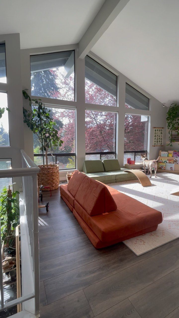
Orange and green share the same warm, sunlit energy, so an orange sectional beside an earthy green sofa feels natural instead of clashing. Potted plants in the room repeat the green and soften the orange.
I would let the green sit slightly darker or duller than the orange, so the brighter piece leads. Large windows help, since daylight keeps both colors fresh.
Two big upholstered pieces in strong colors is a real commitment, so choose washable fabric if kids or a dog share the room.
Choosing Color Schemes
Start with how the room gets used. A space for movie nights can take a deeper, cozier color than one that doubles as a home office, where a lighter shade keeps the room awake.
If a color wheel feels like a throwback to art class, it still earns its place.
It has 12 wedges: three primary colors (red, yellow, blue), three secondary colors (green, orange, purple), and six in-between tertiary colors such as blue-green and red-orange.
Begin with one hue you already love, or pull it from a sofa or a piece of art you own, then look across the wheel for partners.
Black, white and gray sit outside the wheel and work as neutrals alongside any of them.
Before you buy a gallon, get a color card and a few sample pots, and test them in the room itself.
Cohesive Flow in Homes
Your living room is rarely a closed box. Standing in the hallway or dining area, you can usually see into it, so the colors should relate to the rooms around it.
You don’t have to match.
Pick one or two shades from the adjoining rooms, such as a trim color, a wall tone or a recurring neutral, and repeat them in the living room. That keeps the move from room to room smooth.
If you want to go bold in here, a single color in several shades is a safe way to do it. Mixing lighter and deeper tones of one hue adds depth and contrast while the room still feels harmonious.
Light, airy Benjamin Moore colors like Windy Sky 1639, Cloud White 967, and Healing Aloe 1562 introduce a sense of lift and luminosity to living rooms, reflecting natural light to make the space feel larger and more open.
Integrating Decor Elements
Window treatments are an easy place to put your palette to work, especially if the walls are off limits. Roller shades, Roman shades and drapery come in hundreds of colors, patterns and textures.
Layering drapery panels over a shade gives you more control over light and color.
If your palette is already busy, go neutral at the window. Cellular shades and solar shades come in quiet neutral tones, and wood or faux wood blinds can be painted or stained to match the room.
Hold a fabric swatch against your sofa and rug in daylight and again at night, since warm bulbs can shift a gray or greige noticeably, and only then buy the yardage.
Frequently Asked Questions
Do dark walls make a room look smaller?
They can, because deep color closes in the edges of a room. Leafy plants soften a dark room, because the green reads as living color against the paint and breaks up the flat wall.
What are the most popular paint colors for a living room?
Soft, warm shades lead the list. Benjamin Moore points to October Mist 1495, Revere Pewter HC-172 and Gray Sky 2131-70 as the ones people choose again and again.
Warm greige with soft white trim and natural wood is another safe pick; the cream undertone stops it from turning cold, and it sits well next to nearly any sofa.